I think you know by now that I am bored silly by beige. I know it has its place, but it just freezes the creativity out of me when color is called for but the client is just afraid to indulge.
Indulge? Yes, because that is exactly what it can become. An indulgence. Big, bold use of color is probably not good if you’re only thinking of resale value. Color makes a statement. It says you have a personality maybe bigger than life, and that’s what YOU want to surround yourself with.
My latest client came with just such a request. Her condominium had been doused with mind-numbing neutrals. And the lady loves Red!
I’ve got to work backwards because I just have to show you how a pop of red inspired the bathroom redo. Here’s the before picture
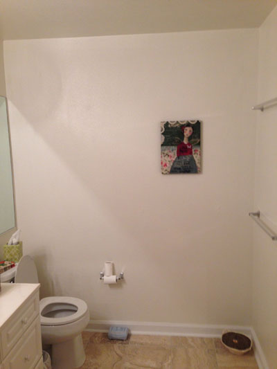
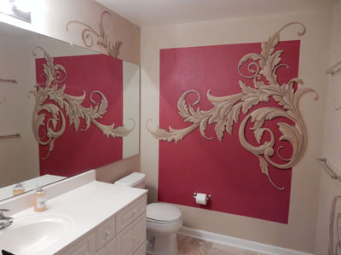
and now, with a huge splash of red.
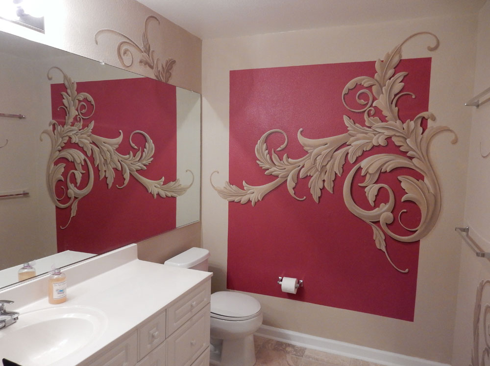
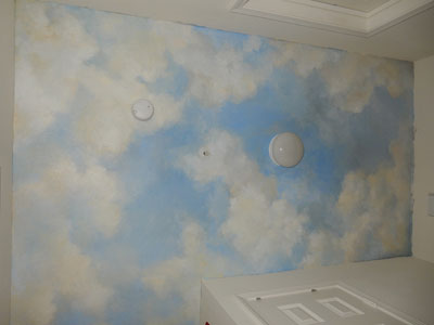
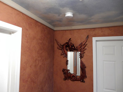
So, now in order of what I did here. First, the ceiling of the long narrow hallway and foyer was filled with soft billowy clouds.
I created a sample of peakaboo plaster, multi-layered mica-infused with the tantalizing peaks of red and merlot peaking through.
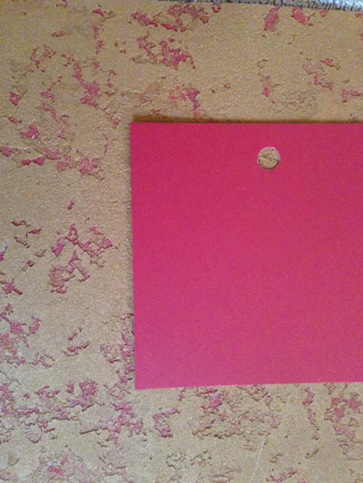
You also see the red I chose for the bathroom here, one of my favorites in the red family, Confederate Red by Benjamin Moore.
A simple trompe l’oeil frame separates the wall from the ceiling.
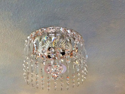
The institutional fixtures in the hallway were just replaced by these flush-mounted beauties.
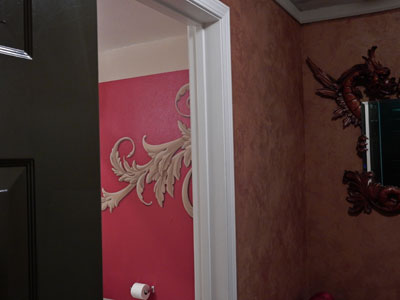
Once the hallway was done it was impossible to leave the bathroom that serves as a powder room beige. This picture shows how the red in the hallway pairs with the block of red in the powder room.
Here’s how it started to shape up once I had blocked in the scrollwork freehand and started adding highlights and shadows.
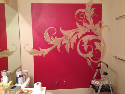
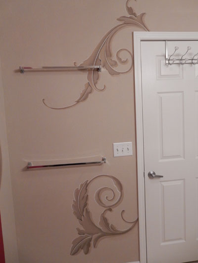
The rest of the powder room echoes with rich ochre and tan scrolls.
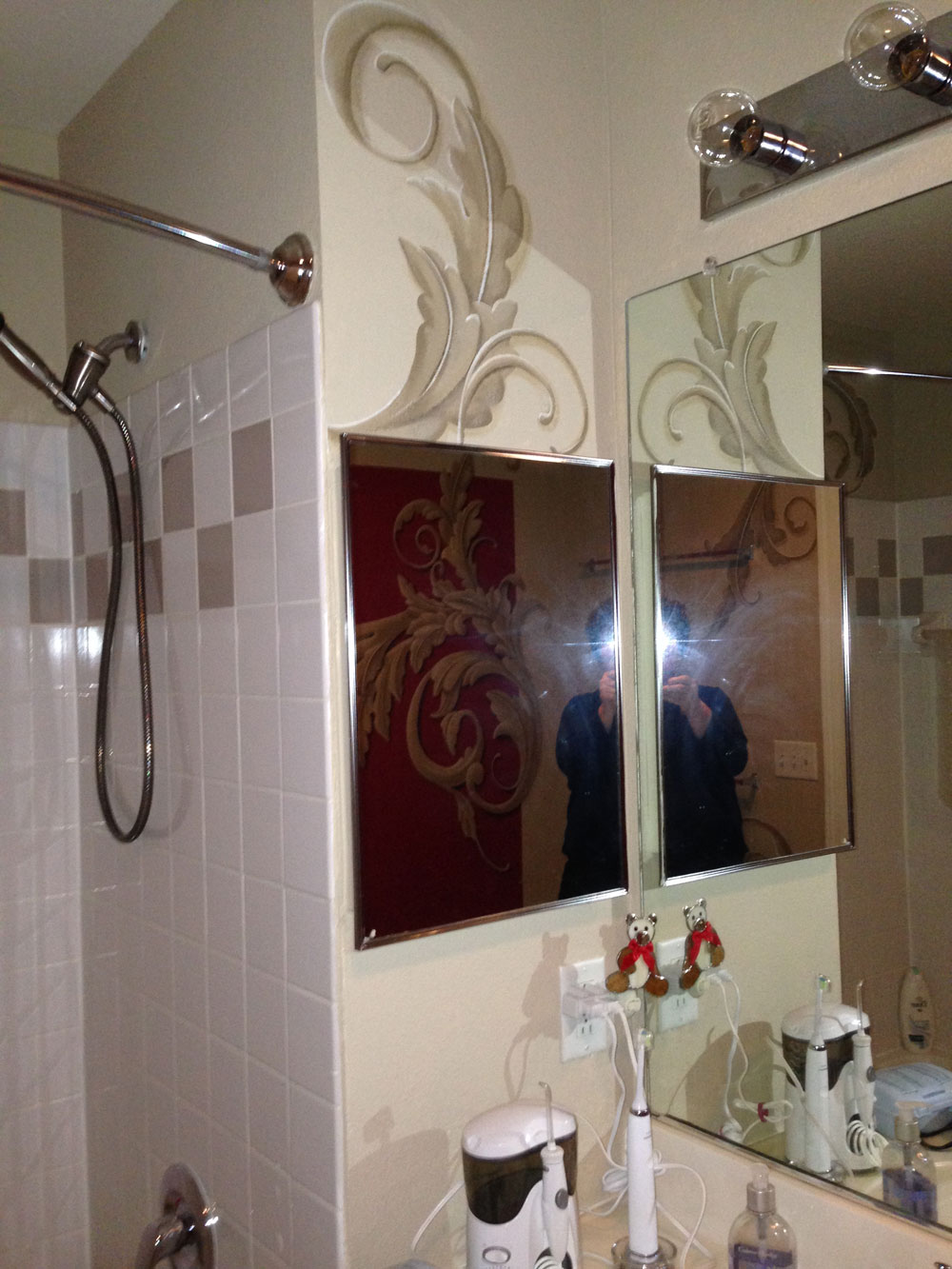
See below one of the difficulties of taking pictures of mirrors (unintended selfies!)
Color, texture and large scale artwork…what’s not to love?
Want to make a statement of your own? You deserve the indulgence.
Best of the holidays to you and yours!


Sorry, the comment form is closed at this time.