From time to time, projects come across my desk that I consider remarkable. What makes them so? In the two cases in this month’s newsletter, the common thread is that both would challenge me to use a skill set out of my comfort zone.
The first was an opportunity to paint a large-sized canvas measuring 64″ by 103″. See it below.
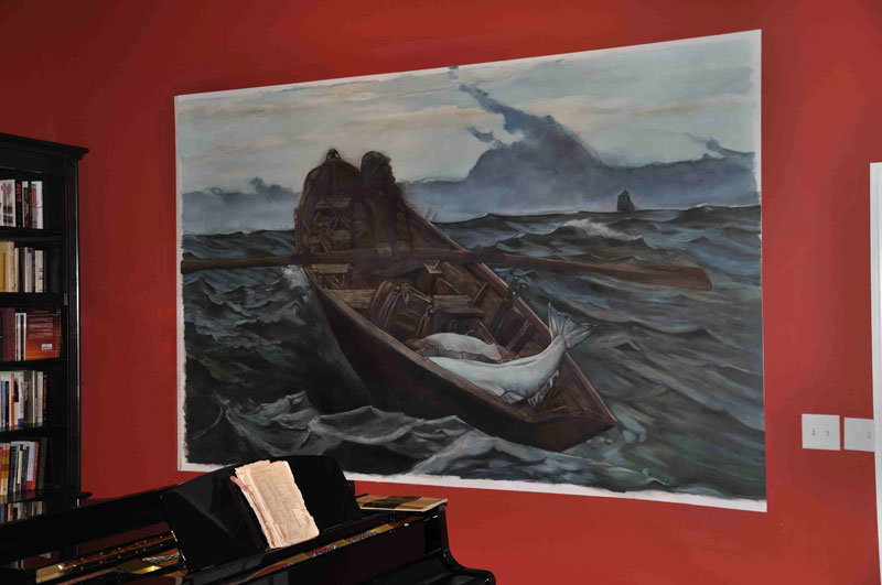
It is the “Fog Warning”, after Winslow Homer. Usually, the first, and I think more difficult step of a mural project is composing the design. Not a problem here. Here was an exquisite composition; the challenge was to decipher the artist’s palette and brush strokes. I obtained a large print, and then enlarged it section by section to analyze the movement of the original painting. I enjoyed the process once I allowed myself to relax and embrace it. A frame is in the works, but I couldn’t wait to share.
The second challenge was so very, very different. I had an opportunity to work on this with the talented Ashlie Bickford of A Fabulous Finish in the Woodlands, Texas. We had an assist from Ashlie’s partner, Kindra Benge, as we got close to deadline. Indeed, even our wonderful client pitched in when it came time to add Bling!; but I’m getting ahead of myself.
The challenge, transform six quite traditional columns in this elegant dining room. I am so used to working so tightly, so it was great fun to let go (OK, in a very controlled fashion) and trust the trowel to do its work.
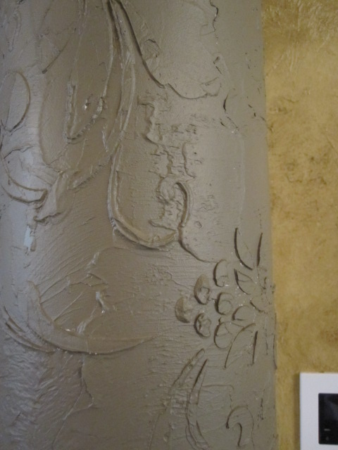
The columns were first covered overall, excepting capitals and bases, with heavily trowelled texture. Once dry, a flowing flourish design was spiraled around the column providing an additional layer of texture. Here’s a picture after the plaster was dried and given a base coat.
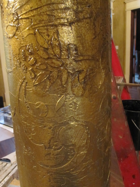
Following this, antique gold foil was applied, and then glazed with a deep umber brown that illustrated all the details in the texture and the embossed stencil. This picture shows the difference the glaze makes. Only the top portion has received glaze. See the difference it makes when applied to the foil?
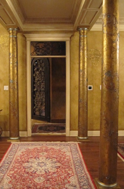
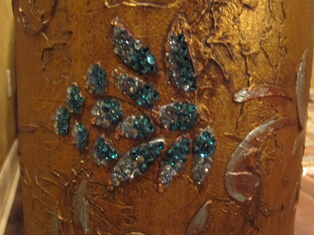
Next came dry brushing with metallic paints in bronze, teal, saffron and pewter to highlight the flourishes until finally, we were ready for the crowning touch! Layers of closely stacked Swarofski crystals in teal and amber to accent the flowers in the flourish. In case you’re wondering, there is no secret in applying the thousands of crystals we used. They go on one at a time. Here’s a finish shot.
Here is a closeup of the crystals.
I never get tired of asking: I’d love your feedback.


Sorry, the comment form is closed at this time.