I keep calling it a lovely powder room,but actually, it is a full bathroom. As the shower area was completely tiled and not part of my project area, it’s remains one of my favorite powder rooms. The why of that is easy; it required no construction and relied simply on paint to get a dramatic transformation and embraced all of the owner’s favorite things. Best of all, it employed a brilliant twist on the part of the designer, Eileen Segalman. Pure genius on her part. To get to know more about her, find her at www.eileensegalmaninteriors.com
More about the twist later.
This is the powder room I first met.
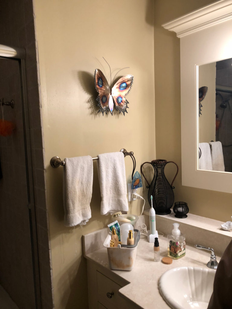
A lot going on, a dated color and nothing to invite you into the space. The first thing Eileen recommended was a new color for the walls. She chose Benjamin Moore’s Quiet Moments. I suggested painting the ceiling the same color. Transformational, giving the room a very spa feel. Never be afraid to paint the ceiling the same color in a small space. It does NOT make the room feel smaller or the ceiling closer. In fact, it does just the opposite and leaves the four walls and ceiling as a continuous space.
Knowing how much the owner enjoyed her wonderfully designed gardens, flowers were an important starting point. Eileen chose to up the sophistication level by using flowers in traditional chinoiserie. We all agreed instead of using the expected very graphic birds usually seen with chinoiserie, we would choose amongst native Connecticut birds. Which walls to paint? Well that is where the genius comes in, but you’ll have to wait to the end to see it.
I took photos of the wall area and then drew my design in place to help the owner visualize exactly how it would look.
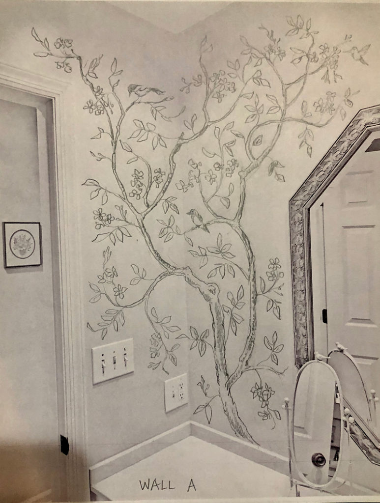
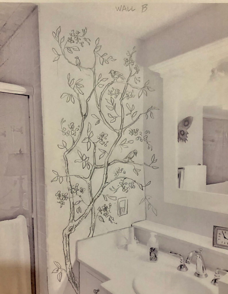
Lay the design out in charcoal.
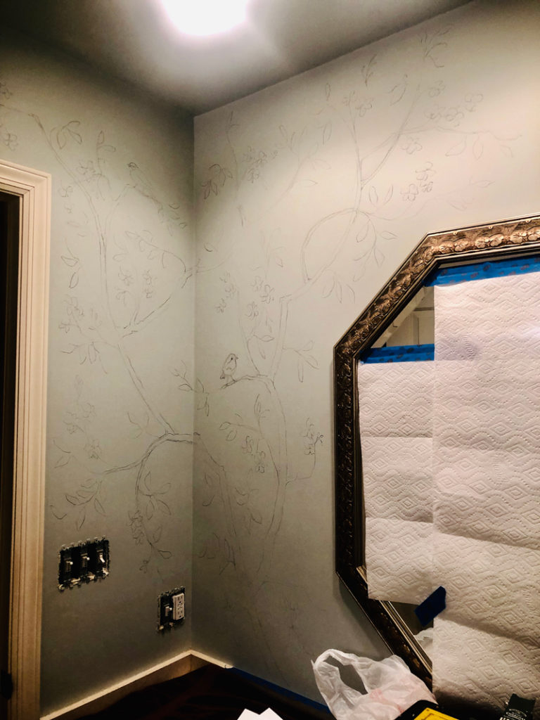
And it’s painting time!
Here’s some progress shots of the branches, leaves and flowers. Getting ready for the birds.
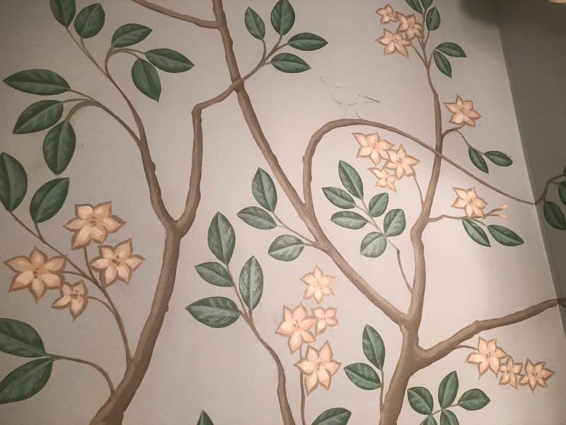
I keep using the word favorite, but it suits perfectly. Is not this fat little robin perfect?
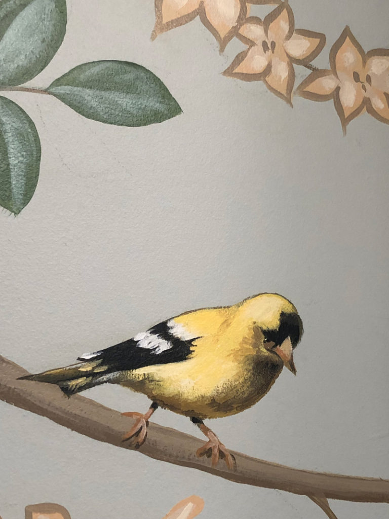
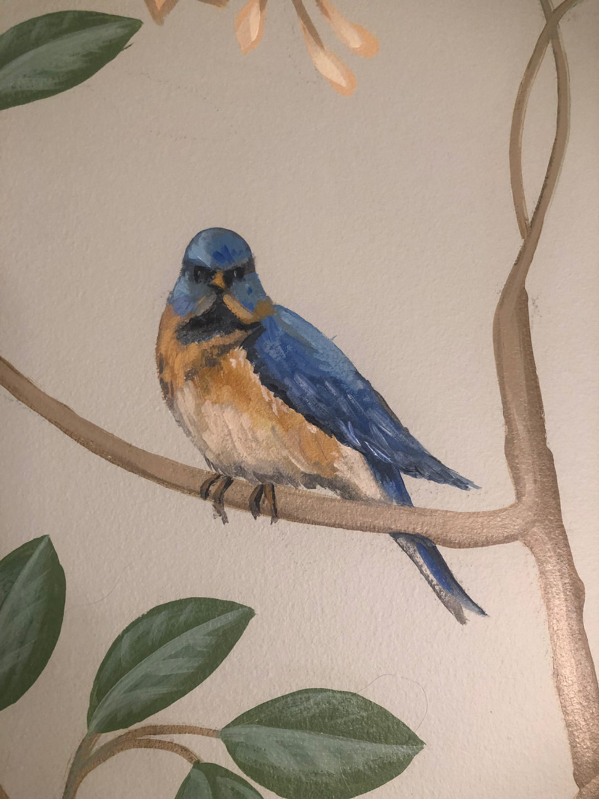
This goldfinch is high on the pecking order too, along with a very stern bluebird keeping watch.

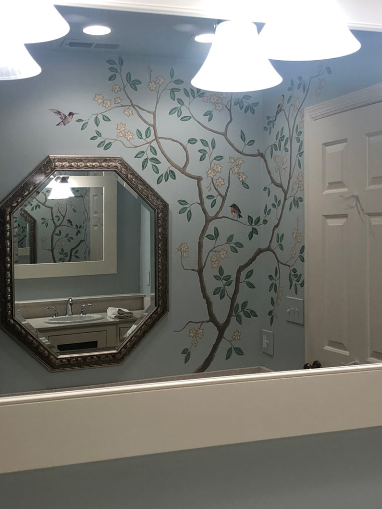
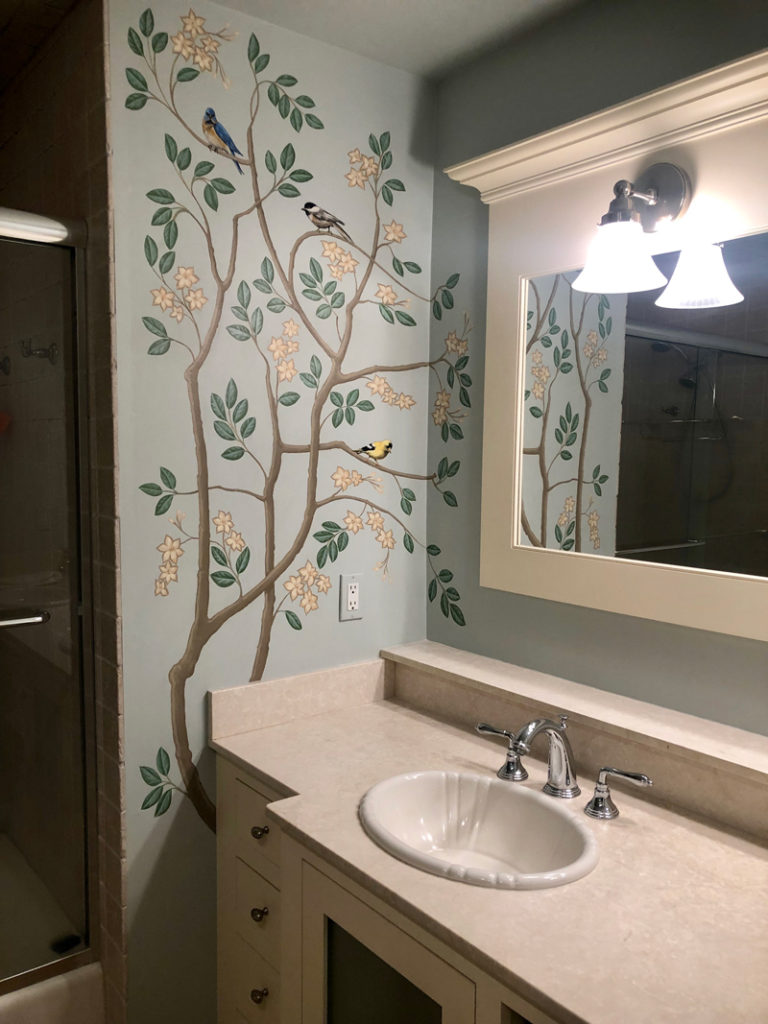
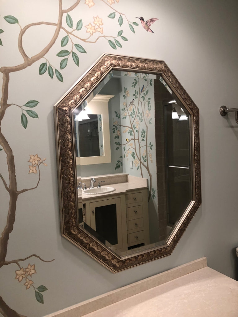
And now, the final reveal. The effect is so cool. (I know, I’m dating myself but that’s just what it is. Too cool.) Eileen picked only two of the four corners of the room to painted. It kept the cost down without sacrificing effect. Eileen took advantage of the two opposing mirrors in the space. A large framed mirror over the double vanity on one wall, and a decoratively framed mirror on the opposite wall. This situation creates the infinity mirror effect. Each mirror captures the view in the opposite wall and doubles the illusion with nary a brushstroke.
So take a look at this stunning space now.
Looking for q little paint magic yourself? Let’s talk.


Sorry, the comment form is closed at this time.