Last month, I had just completed the garden mural in this master bedroom. Recently, I finished the rest of the room and wanted to share just how much was going on, and how it all came together.
I am very protective of my clients, and in this case, even more so. This project started after the loss of my client’s beloved husband. However, it had been in the making before that. His opinions were noted, his choices honored. When we encountered a stutter in progress, we acknowledged his presence. We have laughed and cried in this room.
The trim color was picked by him for the master bedroom suite. Benjamin Moore’s Simply White. It showed the moldings to their best. My job was to come in, then, with neutrals that’s could hold their own and pair with the Simply White. My best find in this project was a newer Ben Moore color, Ice Milk.
It was used on the ceiling and then I mixed its match in Lusterstone. Ah, lusterstone, my favorite plaster, with its shimmer of mica. Perfect for the reflections the chandelier would spread.
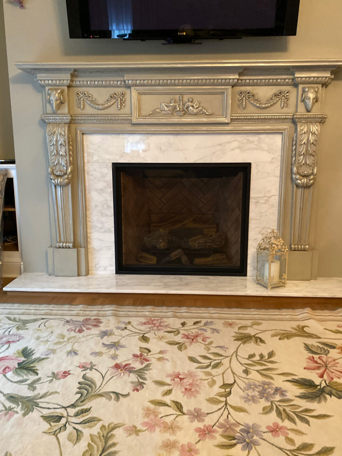
Before I share pictures of that, I need to backtrack and show how all parts of the room intertwined in design and color. Check out the fireplace surround in its raw state.
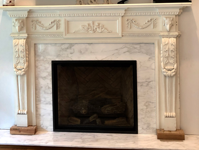
It was then painted in one of the two wall colors.
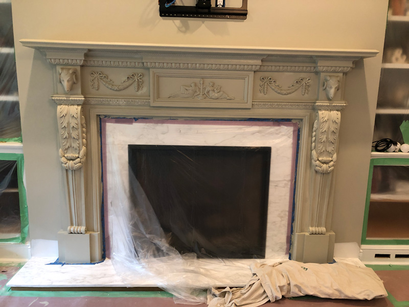
And then the love began. I first waxed the mantel in clear wax to seal the surface. Following that, a custom mixed charcoal wax was then applied, giving detail where needed but softening the harder edges.
Lastly, I alternated with gold and silver finishing waxes. (Nope, I know you’re wondering, you can’t mix them together to get the same effect!) My way makes it hard to decide which is the favored color. I am so pleased with the effect.

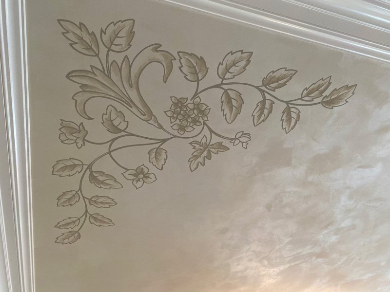
A clue, here, friends. Check out the antique French carpet in front of the fireplace. The lovely motif begged to be repeated on the ceiling. I made a pattern and then transferred it to each corner. Although it was a little awkward to tape in place, the pattern was a necessity. I normally would transfer with a charcoal pounce pattern but the delicacy of the lusterstoned ceiling prevented that. I’d never be able to clean the residue off. So, I lightly penciled each corner.

Here’s a closeup of one of the corners completed.
And so lets take a look as the room came together. Here is the finished ceiling.
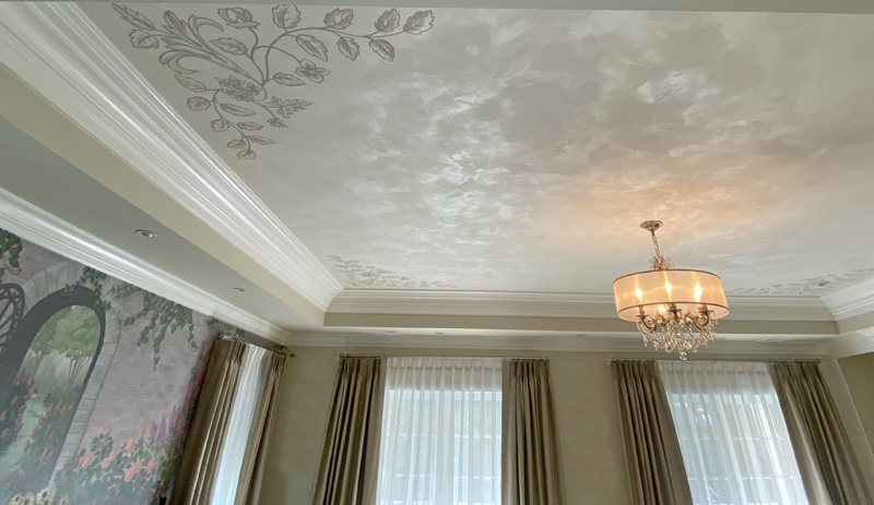
You are also getting your first look at the gracious and elegant window treatments designed by Dyane Prezioso ( learn more about her work at www.Shadeelady.com).
And back to the beginning, the bed set in front of the garden.
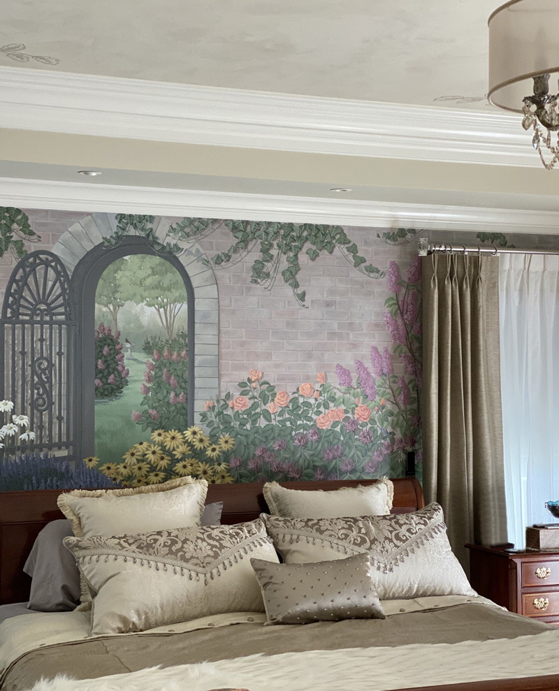
Such a peaceful tranquil space. I know more than paint magic was going on while I was working here. You can feel the love.
Still. Always.


Sorry, the comment form is closed at this time.