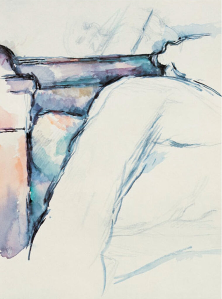
Once in a blue moon, or so, I get a request that leaves me fumbling for an easy answer. Most mural projects have a sense of direction. This recent one was quite the exception. My client had been to Metropolitan Museum in NYC to see a collection of 250 drawings done by Paul Cezanne. There was just something about the sketch entitled “The Unmade Bed”. It resonated with her and she wanted to use the image in her own home. I’m clicking while I’m talking to my client, and nothing is coming up on google search except for this image.
And a definite and determined client that wants it on her wall.
And a perfect wall in her loft bedroom, flooded with light. I’ve gone through all my artbooks and find no mention of the Unmade Bed. All I have is this notation from the Met Collection. “Paul Cezanne’s The Unmade Bed (c.1885) is a drawing made in the artist’s own room.
At this time, Cezanne often drew small details of his everyday surroundings. This drawing demonstrates Cezanne’s philosophy: Drawing and painting are not different things. To the degree that one paints, one draws. The more the color becomes harmonious, the more the line becomes precise.”
So first we talk about method and size. My client does not want it painted directly on the wall. Should she move in the future, she would have to leave it behind. OK, the next easy suggestion, let’s use a stretched canvas. Easy to hang and portable. No, the raised stretched panel would have a shadow and indicate that it’s simply a decorative panel.
We discuss canvas, and I’ve always seen floating pieces of canvas framed to protect the edges. No to the frame. She wants this to look as close to looking like a mural painted directly on the wall as possible and there is no chance that the raw edges will be compromised. Ok, so a floating panel adhered to the wall. A few layouts to see what size we are comfortable with and we are on our way.
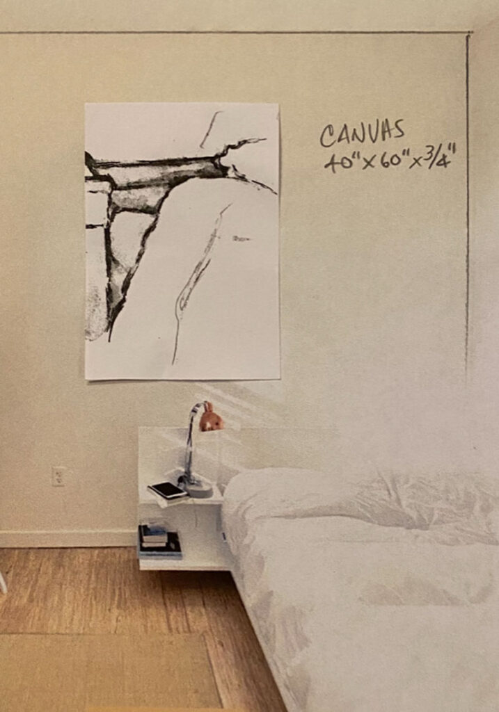
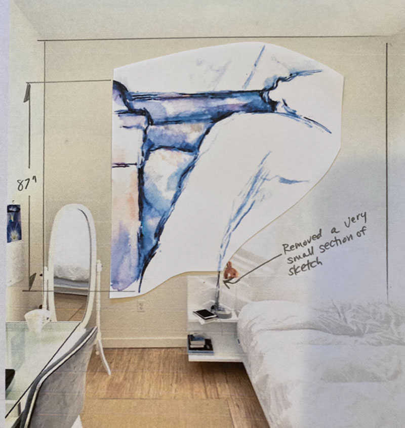
We end up with a size 48” x 62” on canvas that is painted the same color as the wall it will be floating on. I viewed my first painting with a bit of wariness. When I had enlarged and painted the image, the penciled and water colored edges were harsh and very deliberate. This came from taking areas that were inches in area and enlarging them greatly.
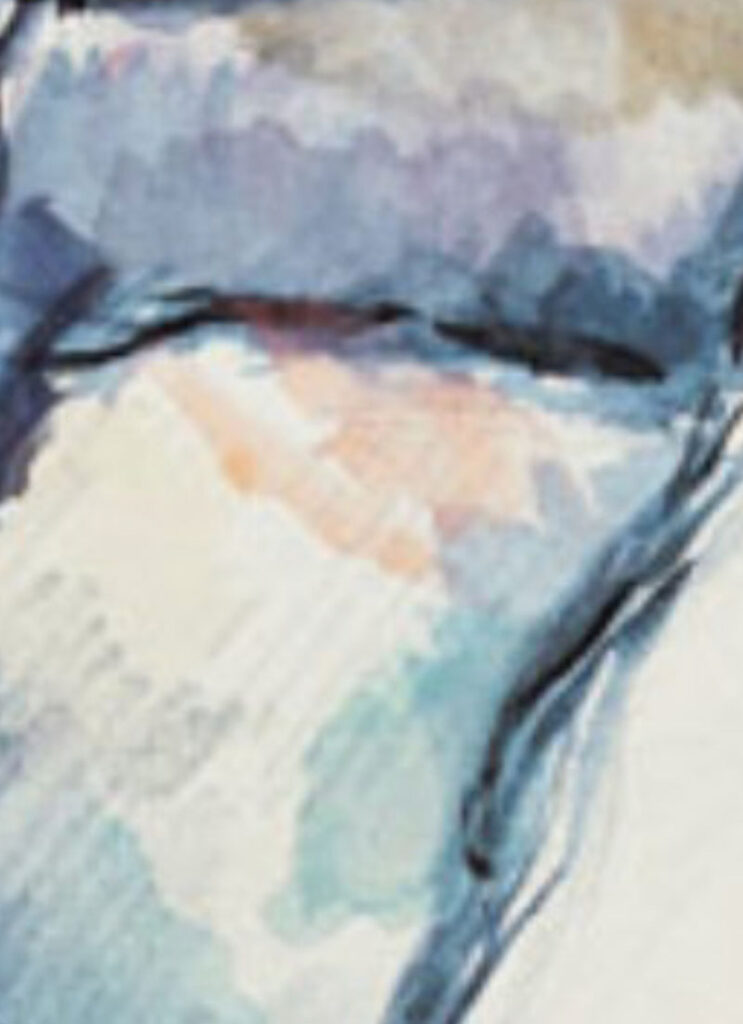
The softness of the blended colors was missing so it was a joint decision to soften the color and line edges. I must admit, it’s more than a little daunting, tweaking a Cezanne. But when it was done, it was exactly what she wanted. Here’s the installation being handled with kid gloves, and the finished work on the wall.
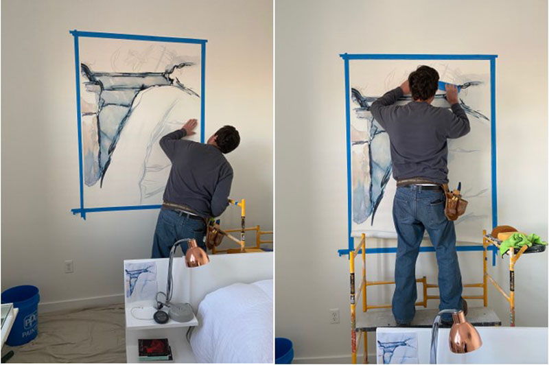
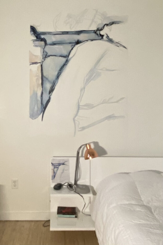
The best words of thanks? This note that came with a tongue in cheek captioned photo, the “real” Unmade Bed.
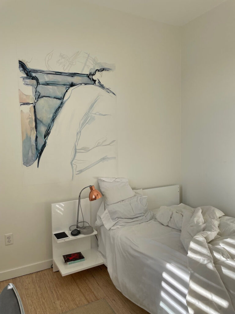
The note: “Just wanted you to know that living with your painting is an ever-changing, magical experience for me…thank you.”
Paint magic, I’ll take that any day of the week.


Sorry, the comment form is closed at this time.