One of the biggest misconceptions that people make about decorative painting is that it’s only something for mansions. That artists like myself are only interested in big, lengthy (read expensive) projects in high end properties. I’d like to use this newsletter to illustrate just how wrong that notion is.
Many of these are smaller scaled design solutions that took only a day or two to complete.
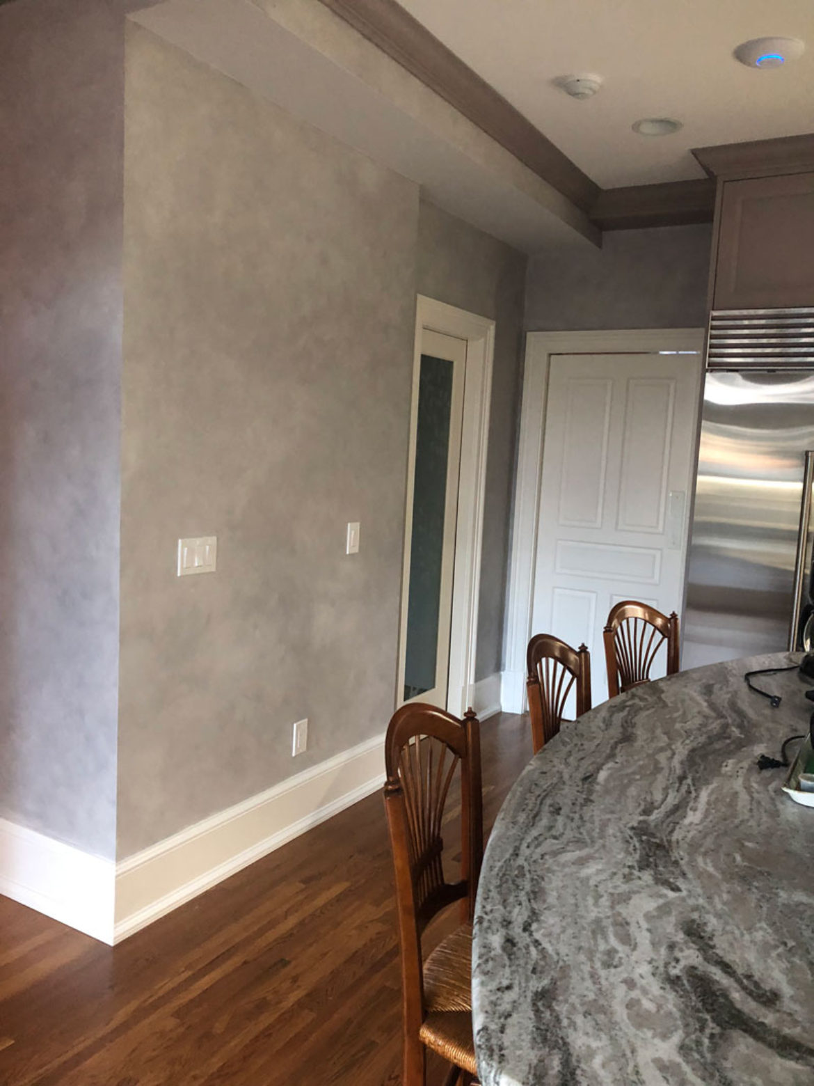
This first example is a simple, glazed finish for this kitchen in Darien, Connecticut. I didn’t want to compete with the gorgeous jaw-dropping countertops, so the glaze served as a perfect transition from the intricate patterning found in the stone. The grey has just a hint of plum that matches the same overtone in the cabinetry.

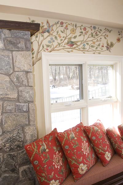
Next, the windows flanking the fireplace in scenic Seymour, CT framed a view too pretty to block with window treatments. Instead, I used the lovely flowered branches and bird motifs found in the sofa fabric to marry the walls to the rest of the room.
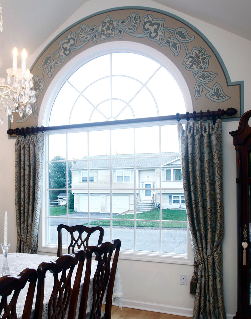
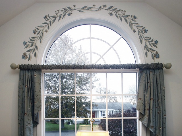
And when it comes to window treatments, simple panels soar to the next level with the addition of a painted border. Both of these designs were driven from the fabric patterns.
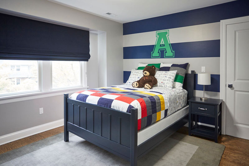
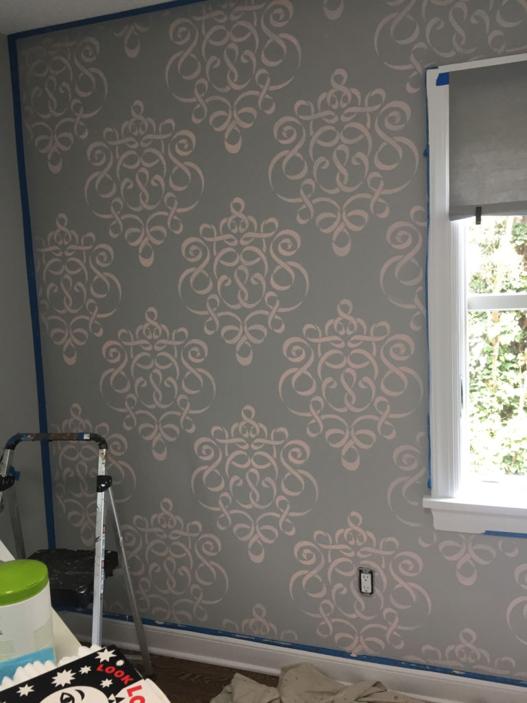
The focal wall in a child’s room can seal the deal! Check out how Anthony’s room in Larchmont, NY came alive with bold horizontal stripes and a sports derived initial. The contemporary scroll is perfect in the sophisticated grey and pink palette in this precious baby’s room. The bonus of both these approaches is that both designs will have long life, well past the baby and toddler years.
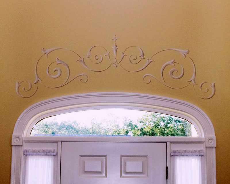
Traditional scrolled ornament is the best bridge to fill the extra space above the door in a two story foyer in Huntington, CT. Nestled over the transom window, it is an effortless and graceful solution.
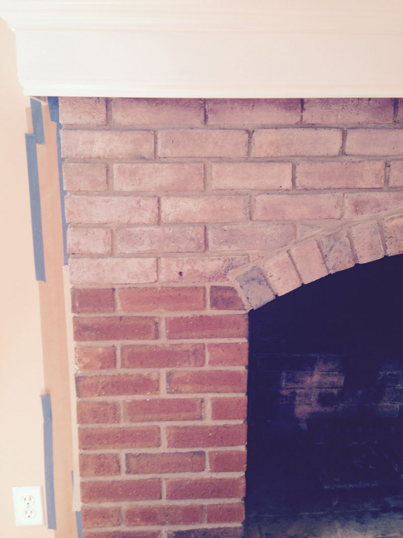
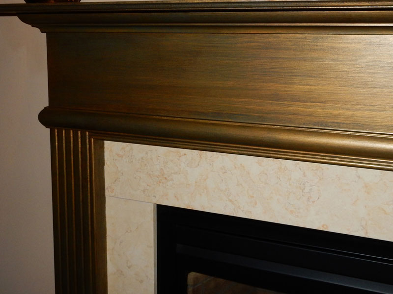
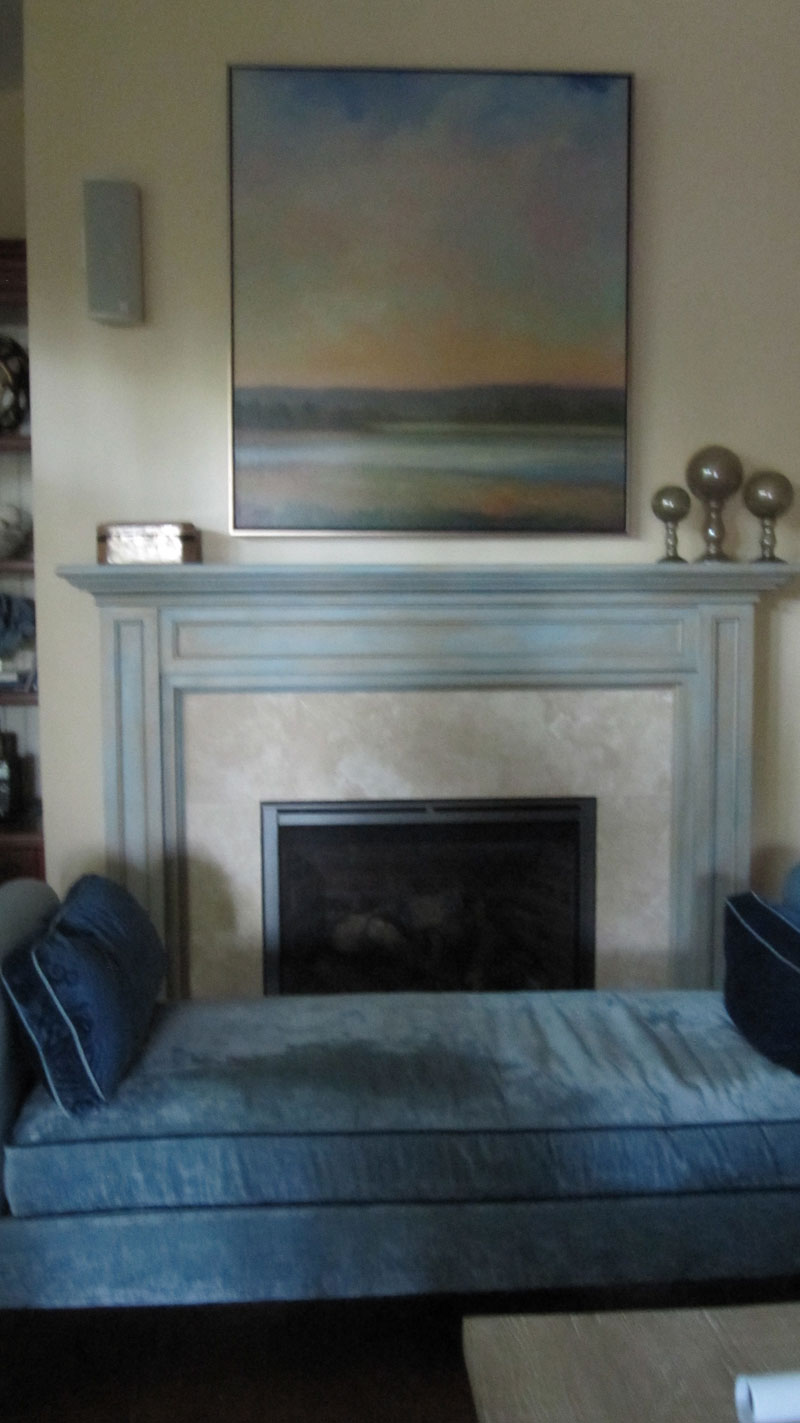
A change up on a fireplace or its mantle is easy on the budget. Here’s a few. First, a whitewash, or more accurately, a gray wash, gives you the opportunity to lose the red brick and go in dozens of different color directions. The two mantles are infinitely more interesting than the builder’s white paint they began with.
In the first, in Newtown, CT, glints of turquoise peek between bronze and champagne stried glaze. The second, in Fairfield, CT, features a distressed cream and blue treatment with an aging umber glaze.
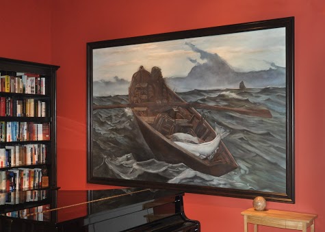
Sometimes, a prospective client is intimated by the disruption to the home with the painting of a mural. Others embrace watching the process. If you are more of the former, having a mural painted on canvas, then attached to the wall (it can be removed and relocated too!) is the way to go. The process is called marouflage, and the edges can be discreetly designed to disappear to existing molding or, like in this picture, covered with molding. I was honored to be asked to recreate a work of Winslow Homer, Fog Warning. See it in its current home.
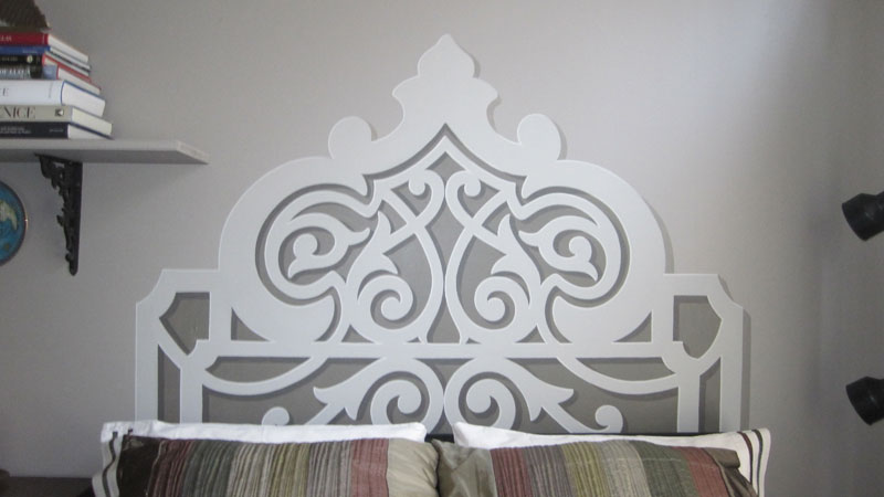
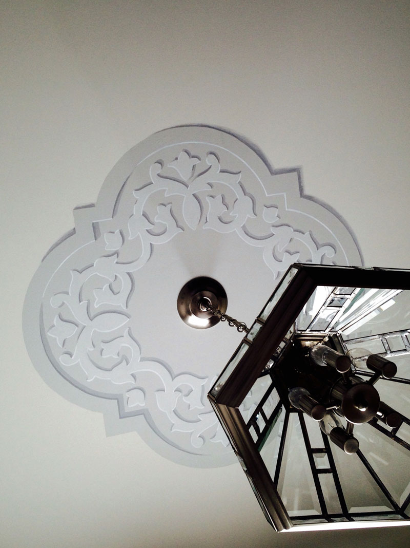
Trompe l’oeil painting (French for “to fool the eye”) uses the painting of lights and shadows to create the look of actual dimension. Both of these were one day projects. The simple medallion on the ceiling gave a nice anchor to the light fixture which previously looked isolated in this sitting area. The hand painted headboard adds a touch of Moroccan flavor to a guest bedroom makeover.
So there you are, a baker’s dozen of some unexpected projects that crossed my path.
Perhaps there’s something that catches your eye?


Sorry, the comment form is closed at this time.