A rose by any name other than DeCandolle’s Rose would just not express how happy I am right now with the universe. Love when the universe gets it right!
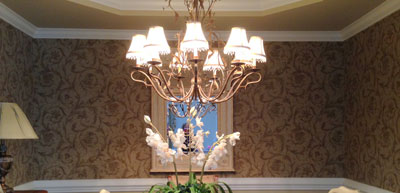
The project for redoing this dining room began as a discussion over a cup of coffee with my client in her home, where I had done some smaller projects. Her dining room, though very pretty, was just not hitting the mark to reflect her personality.
We talked about something floral, and I asked her if she might consider something where the scale was a little less than traditional. She said sure, and I was off and running.
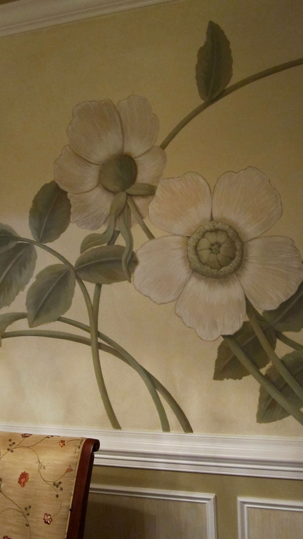
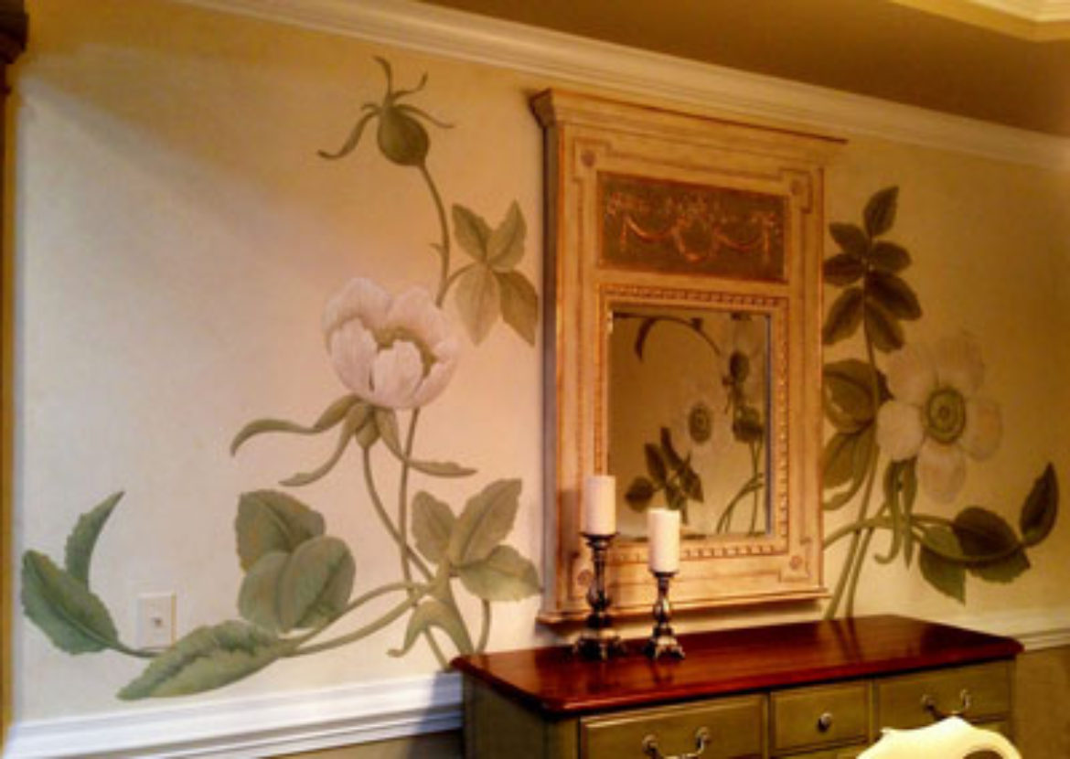
The room seemed perfect for huge, oversized blossoms, with exquisite swirled stems and leaves. My inspiration came from a favorite engraving of mine, Pierre-Joseph Redoubte’s De Candolle’s Rose. It’s beauty to me lies in its simplicity, a sweet briar rose. The sample was painted on a creamy background that I glazed with a pale gold metallic paint. The painting seems so alive, with the gentle shimmer of gold. Here’s my sample.
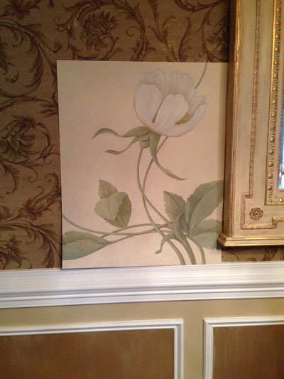
It’s time for the big question. Will my client, Jeannie, love it as much as I do? I’d been vague about what type of flower because until I really sat down to paint, I wasn’t sure.
I unrolled it and watched the big smile on her face. “Roses”, she said. “You chose roses, my namesake.”
Namesake? I was baffled. No Jeannie Rose I knew about. Then she explained. “I thought you knew my given name. It’s Genarosa”. Of course, Jeannie for short. Roses for sure!
So here’s my favorite shot (I think because of the reflection.)

In a wider angle, you can see a little more of the room.
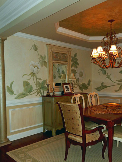
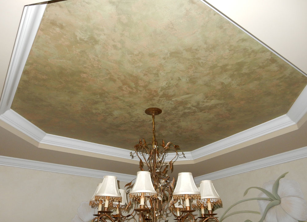
I created a plaster finish for the half columns on either side of the room’s entrance, which was also used on the small tray. The embedded mica plays with the light from the chandelier.
Here is a closer shot.
I also stried the architectural wood panels below the chair rail with the same glaze used behind the mural. The breakfront was treated to a celery metallic finish softened with umber glaze and gilded details.
I also took a panoramic shot so you can appreciate that there is no feeling of repeat design.
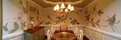
Here is a close up detail.
Thank you, Miss Jeannie, for your faith in my vision. More importantly, thank you for the memories. I hated leaving this project. I had the distinct pleasure of watching first time neighbors and friends coming to see the makeover. I have to admit, it does NOT get old hearing compliments for a job well done.
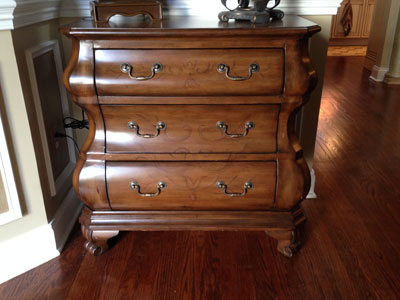
…and while I was there, there were a few pieces of furniture that needed to be “dressed” properly to qualify being part of the new room. Here’s the Bombay chest that was in the foyer area.
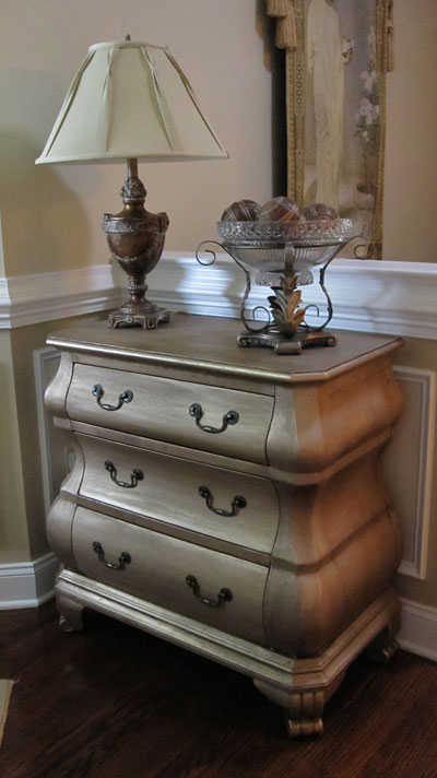
And here it is with a textured plaster finish, which I painted in champagne metallic paint and then over glazed to illustrate the texture in a very subtle way.
I have done quite a bit of work in this Sandy Hook, CT home. You can read more about it in the upcoming issue (Vol.21) of Faux Effects World magazine, available at Barnes & Noble in a few weeks. I am honored to have my work featured in this national magazine.
Like I said, sometimes the universe is right along with me for inspiration. Give me a call if you’d like to see what is possible in your home


Sorry, the comment form is closed at this time.