Both of these kitchen wall solutions started the same way, with a discussion. Both clients were looking for “something” for the wall, but had absolutely no idea of what that something could be.
Sitting in kitchen number one, our talk began. We talked about the interests of each member of the family. We took a walk through the home, and two things became apparent. The window treatments were minimal because everyone loved the view the yard afforded. It was full of trees, nested, as it were, in their very own forest. In almost all the artwork and accessories I saw, there were more trees, branches, leaves…you name it, more trees. So trees it would be. But a little stylized, and make sure I included a special interest in barred owls.
The palette needed to be a subtle mix of blue greens, grays and warm browns. Here are two pictures to give you an idea of the results.
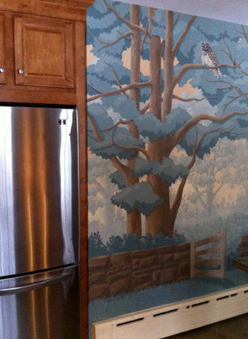
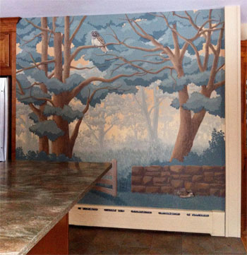
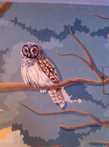
Here is a close up of the barred owl.
The second kitchen wall started with almost an identical discussion. The colors had to be soft; the design, appealing, but comfortable. It’s a small kitchen, and the owner spends a great deal of time in it.
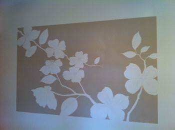
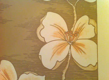
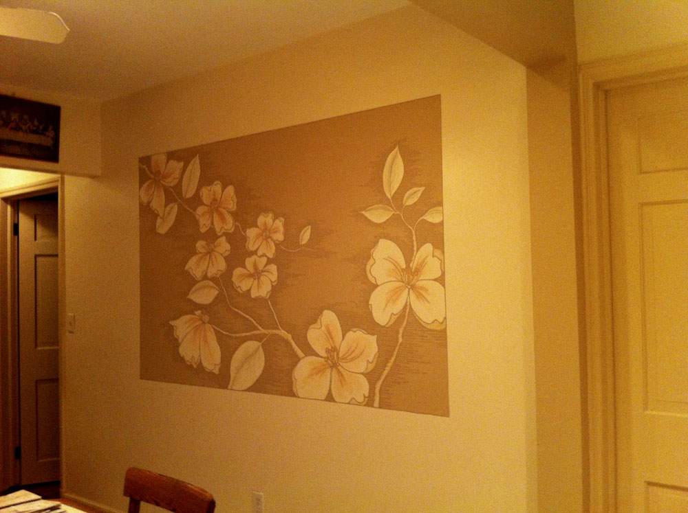
Looking out each of the two windows, one finds a dogwood tree. I had thought of large blossoms initially, and this confirmed it. The palette is very soft. I took the tan color of the trim and added a little more ” chroma”, or color, to it for a monochromatic palette. A blush of rose and green to complement the “easy on the eye” choices.
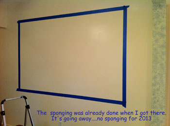
This first picture of the area being taped off shows a little bit of a very dated sponge paint treatment that had been done years ago. I used the same color of my panel background to erase the sponge effect for an overall cleaner look.
Take a look at the steps. Tape it off, draw it in and block it with the background. Add the details for a look you can get lost in.
And finally the finished wall
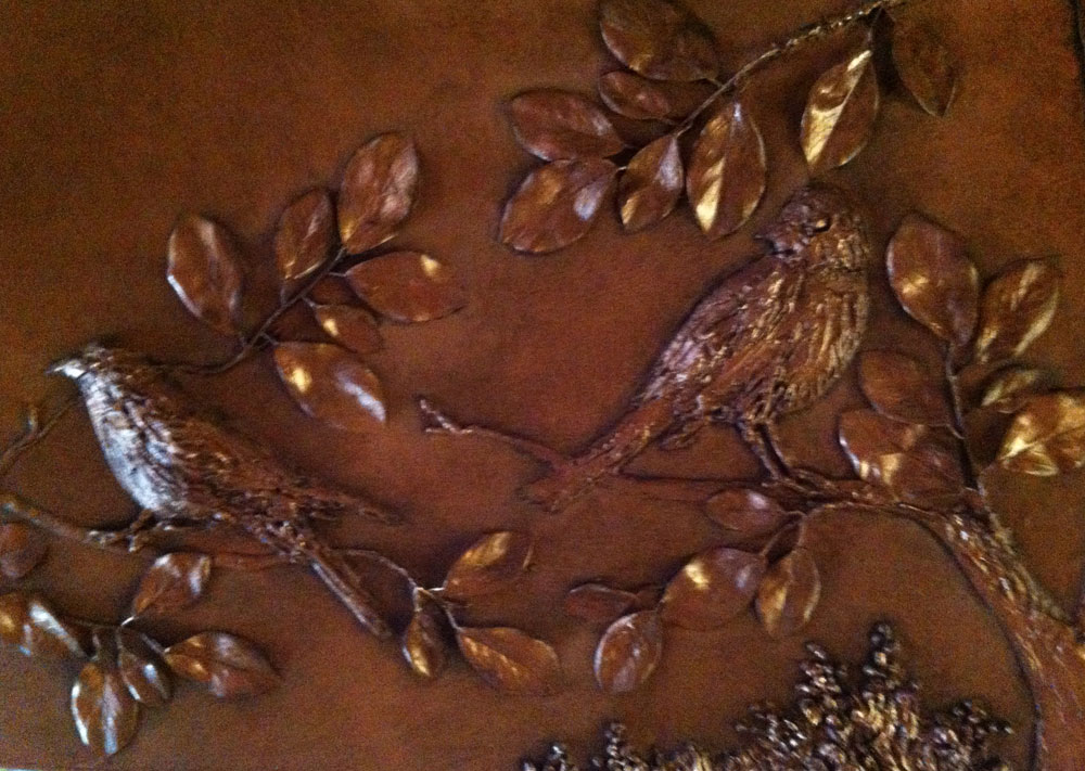
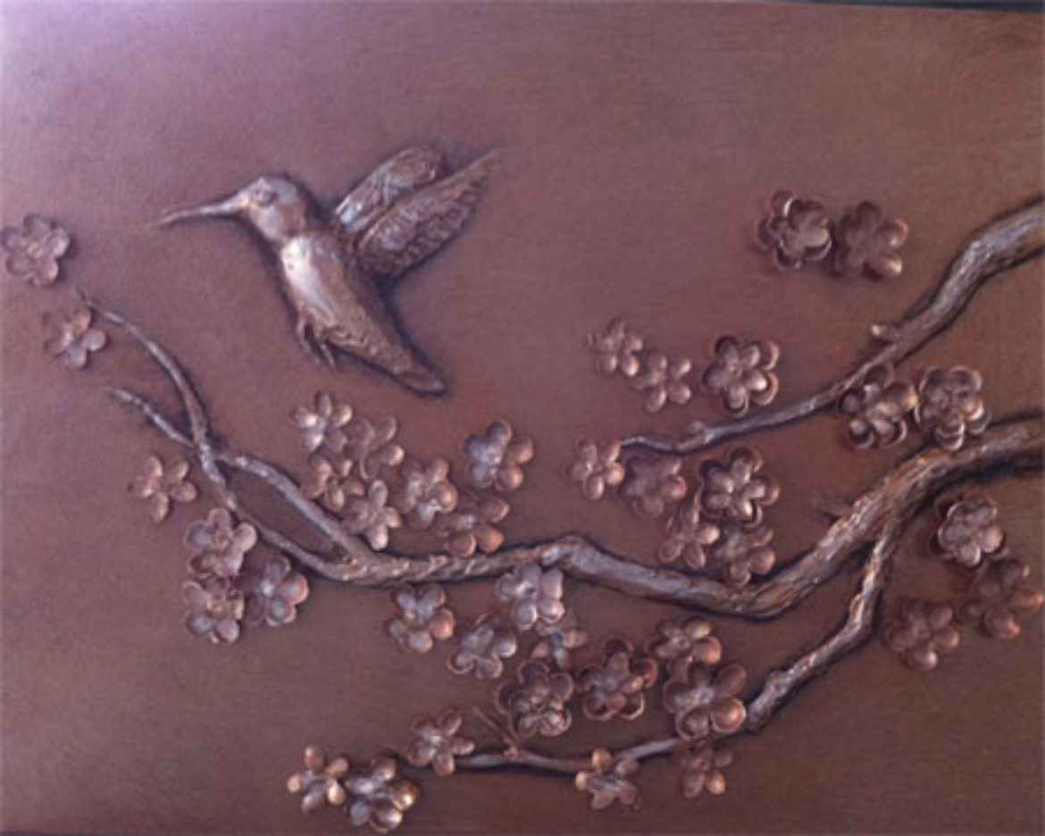
Lastly, I’d like to share a little of my latest endeavors. I have working on “Bas relief” panels on commission.”Bas Relief” is low profile sculpting. The elements in my compositions reach a depth of about ¾”. The leaves and blossoms you see are made of silk. The birds and branches are sculpted, and are raised on the panel. These particular panels have a dusting of metallic color, with the depth enhanced by layers of glaze.
Here are “Backyard Birds”, which measure 16″ x 48″. I’ve included a close-up so you can see the detail.

“Cherry blossoms” measures 2′ x 5′.
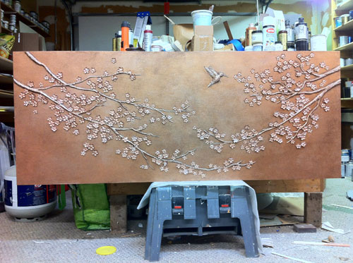
I was so pleased with the outcome that I made the smaller version for myself.

This technique can also be done directly on the wall. Perfect for stairways or foyers.
The possibilities are endless.
Intrigued? Give me a call.
By the by, just a reminder, the Studio is now accepting Visa, MasterCard and American Express. One of my kitchen clients took advantage of that and not only has a project she will long enjoy, but garnered the points on her Visa card.


Sorry, the comment form is closed at this time.