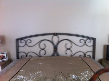
It started as the simplest discussion one could imagine. What could be done to dress up this simple brass headboard? The linens chosen were elegant, providing an equally sophisticated palette of gray and taupe.
Take a look at the headboard to be considered.
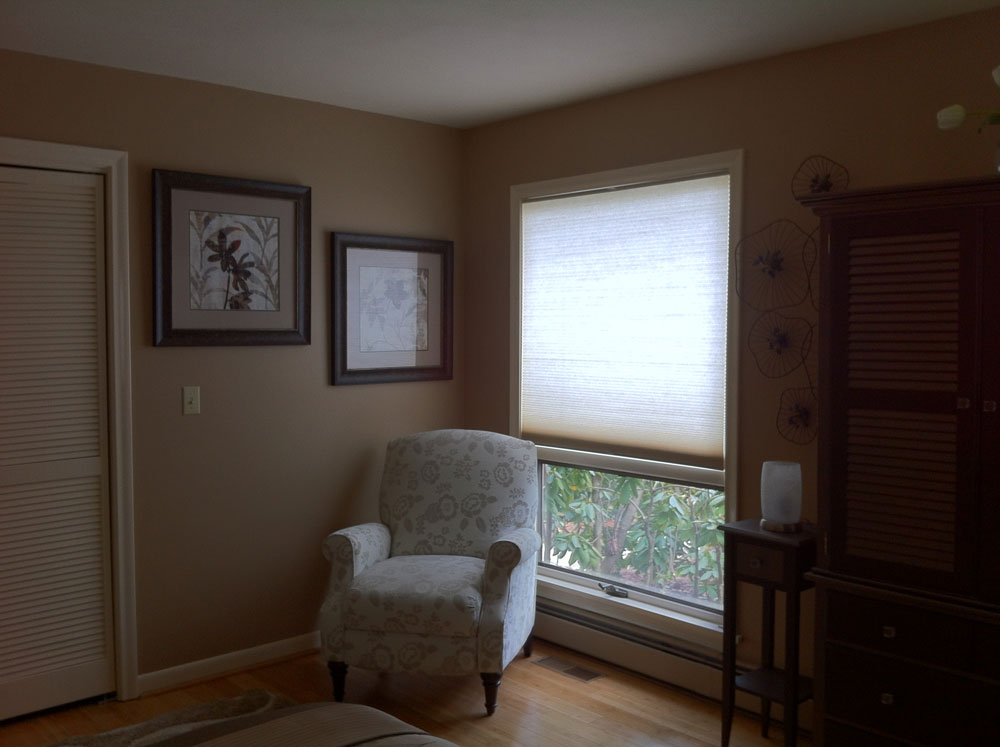
The queen size bed is situated in a well proportioned room measuring approximately 24′ x 26′. Take a peek at what else provides design elements in the rest of the room.
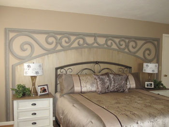
I decided to use the graphic design the headboard provided. My client was quite clear in describing what she saw as the gap needing filling. The design would need to encompass more than just around the perimeter of the headboard. Pictures had been tried above the headboard and just didn’t fill the proportions properly.
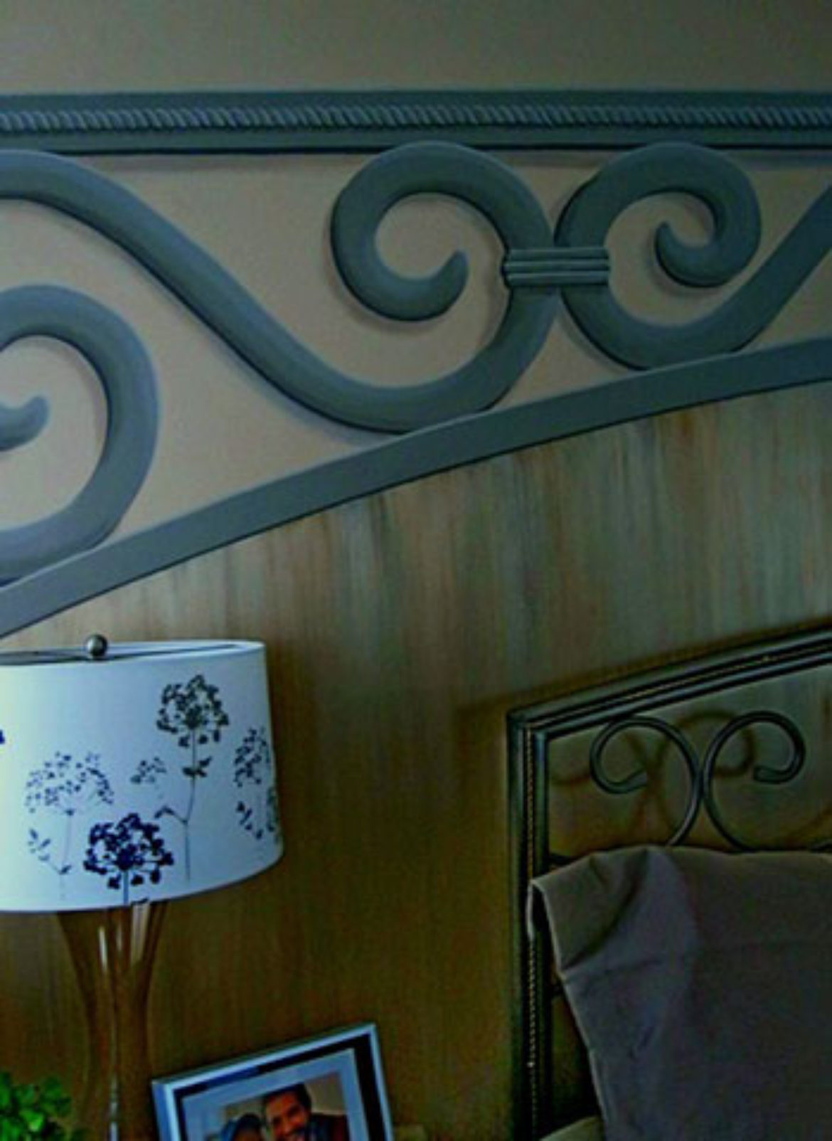
The solution I came up with is certainly grand in scale. The area behind the swirl work is a strie that I created for just this space. Usually a strie treatment describes pulling, or dragging a brush through wet glaze to get a linear effect. Here, the process involved a similar dragging but through many colors and layers of mica-infused plaster.
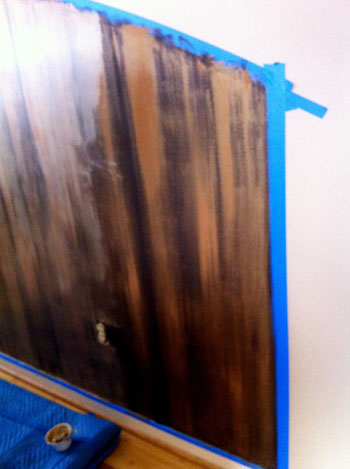
I have to tell you that I always give fair warning to a client that there is an ugly stage before the final effect is achieved. I heard part of a muted discussion between husband and wife as the “ugly” stage was making its debut. Below you can see what ugly can look like while I keep up my mantra, “trust me, trust me”.
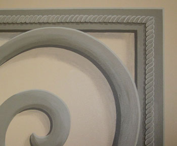
Here are close-ups of the trompe l’oeil and plaster strie details.
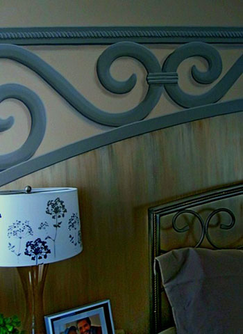
…and without further ado, here’s the finished product.
Love to hear what you think of this solution.


Sorry, the comment form is closed at this time.