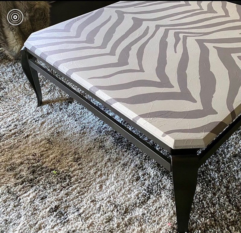
| When I’ve been asked, do I “do” furniture, I mostly think, a little, now and then. But as samples started for yet another piece, I realized, I “do” quite a bit of furniture. Sometimes it’s truly a cost effective method to transform an existing piece to fit into perhaps new or recently redesigned surroundings. Sometimes it’s to add that all important dash of whimsy or elegance-both staples in my repertoire- to a new or old piece. So here we go… A coffee table was treated to a tissue finish for texture and bold zebra striped graphics |
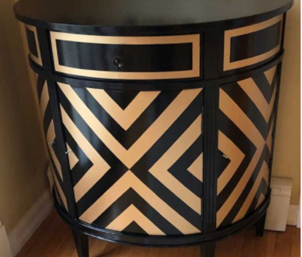
A very traditional piece got an art deco uplift in black and metallic gold, brush applied.

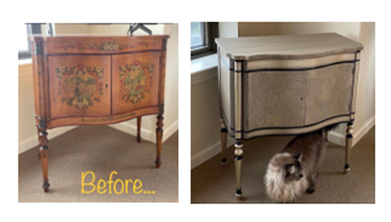
Another traditional piece got star treatment with stried plaster, tissue, metallic paint and glaze with razor sharp accents in black enamel
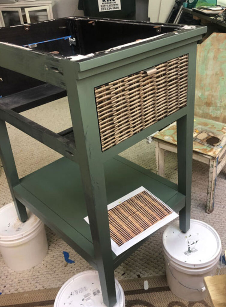
This bathroom vanity had wicker painted in trompe l’oeil. You can see my source inspiration on the printed paper on the lower shelf. It looks so real.
| These two pieces were lovely when first purchased but the wood finish no longer fit the space. Painted in a deep burgundy, depth added with black wax and just the slightest tough of pewter metallic wax for accent. |
 |
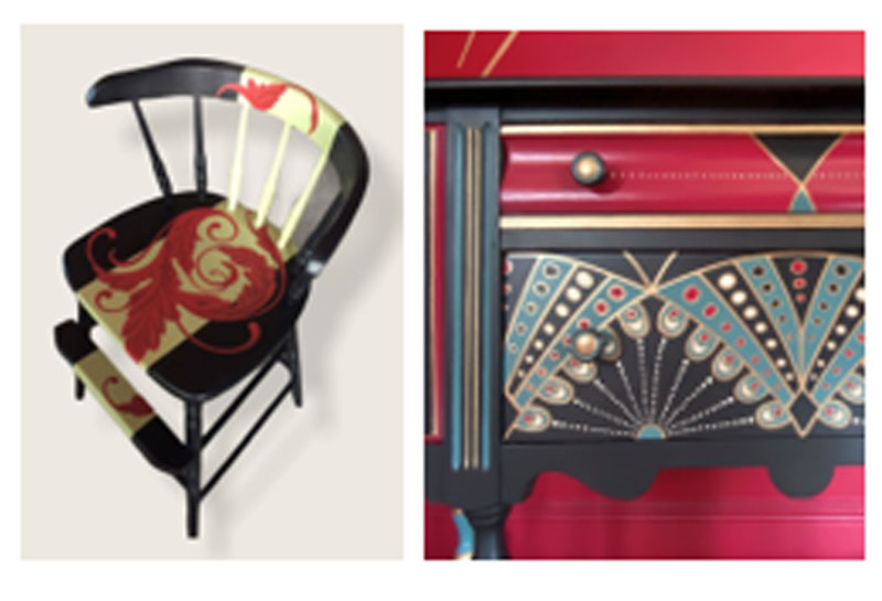
The buffet pictured here is a recent project from earlier this year. I’m showing a close up of the art deco inspired detail and colors. Pictured with it is one of those moments of serendipity. It’s a chair I painted for a “Chair-ity” event where different artists paint chairs which are auctioned for charity. My same client of the art deco buffet then won the chair a few years earlier. Somehow, when we spoke, we knew that those colors would come together when she eventually redid the dining room, where both pieces are now.
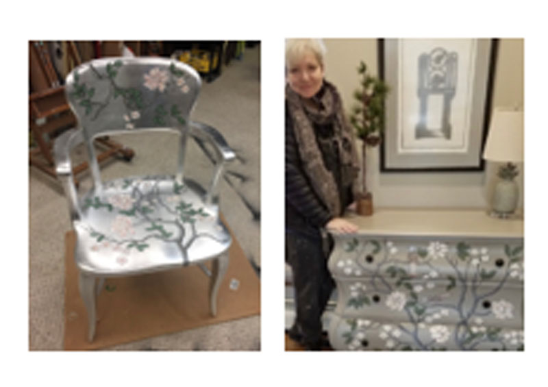
| Serendipity hits again. (Don’t you love it when it happens and you know it!). Here’s another chair I painted for Chair-ity. Completely covered with silver leaf and then treated to lovely chinoiserie. That same person called me to complete a matching look, this time sans silver leaf, for another piece in her home. Happy to oblige, |
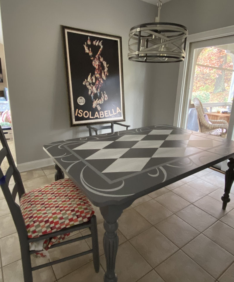
Another wood table is transformed for its update kitchen with bold graphics and scrolls. I have to admit, something very similar might happen to my own kitchen table. I loved the results.
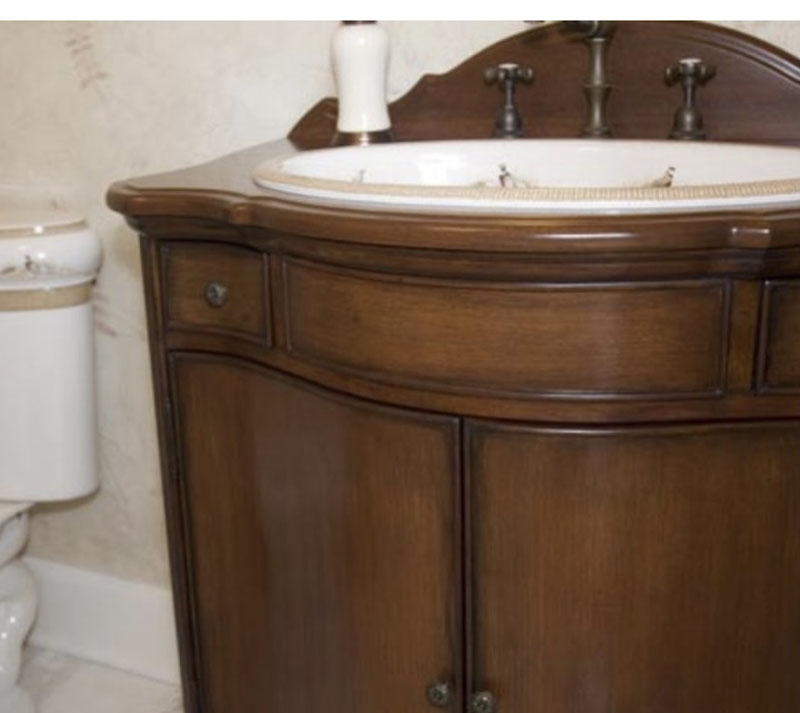
Sometimes, I’m called in to when the client has found the perfect piece but really dislikes the artwork. In this case, I removed a harlequin pattern and replaced it with a soft wood grain.
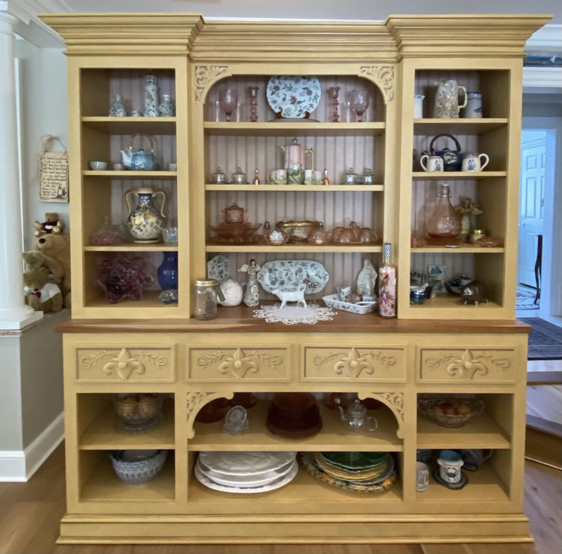
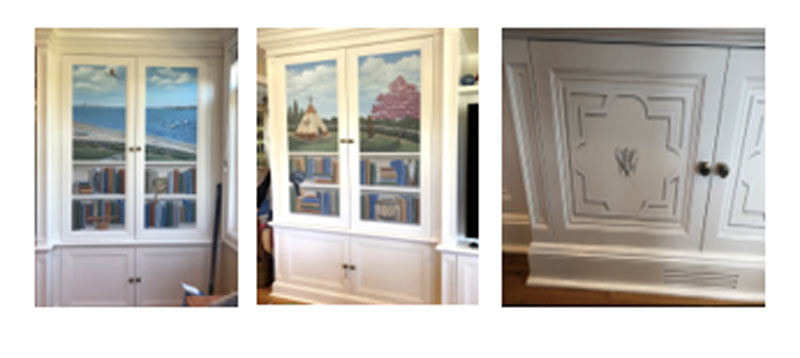
| When a piece is really oversized, the work takes place on site. Always love the opportunity to add trompe l’oeil architectural detail. |
Other times, when the furniture is built in but it would be too time consuming to do on site, I get to paint in the comfort of my own studios. The shelves with books and objets d’art were painted on canvas and then adhered to the cabinet faces like wallpaper. My client was so pleased, I came up for a solution for the bottom cabinets with trompe l’oeil moldings and my favorites, the bee!
| This jewelry chest was redone to match a master bedroom makeover. The ceiling was planked in colors you see repeated on the drawers. |
 |
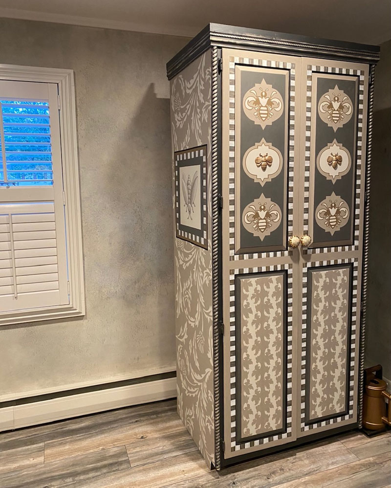
| Once in a rare wild, I get to indulge on my own time for just me. This huge cabinet which we salvaged from a previous home, serves as our mudroom. It is the home of shoes, umbrellas and backpacks. I confess, though you can’t see, I’ve yet to finish the side you can’t see in the photograph. Some day… |
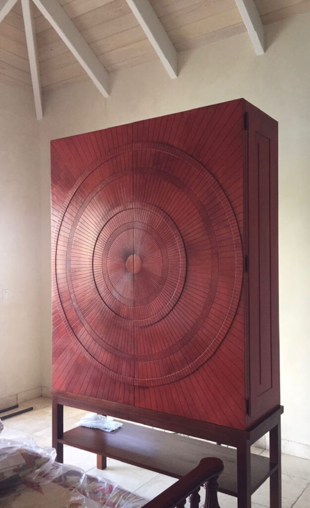
| I do not paint cabinets often, but if you ask me kindly, I’m more than happy to do so if you mention I have to go to St. John’s in the Virgin Islands to do them. A big yess! |
 |
| And while I was in St. John’s, this piece was in need of a little drama. |
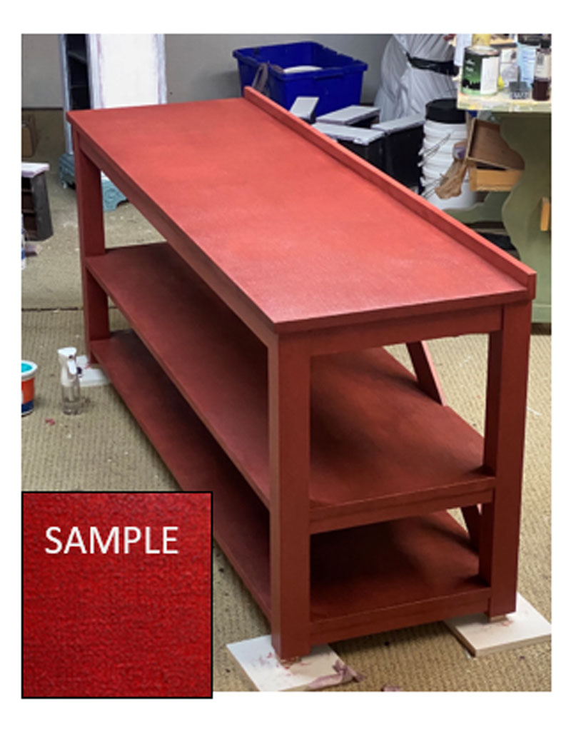
While we’re on a red theme here, take a look at this console I had custom built for my client. Its shelves have a plaster linen finish, painted and then glazed. The sample, I assure you, doesn’t catch its beauty. Once it’s in place in its new home, I’ll show you more detail.
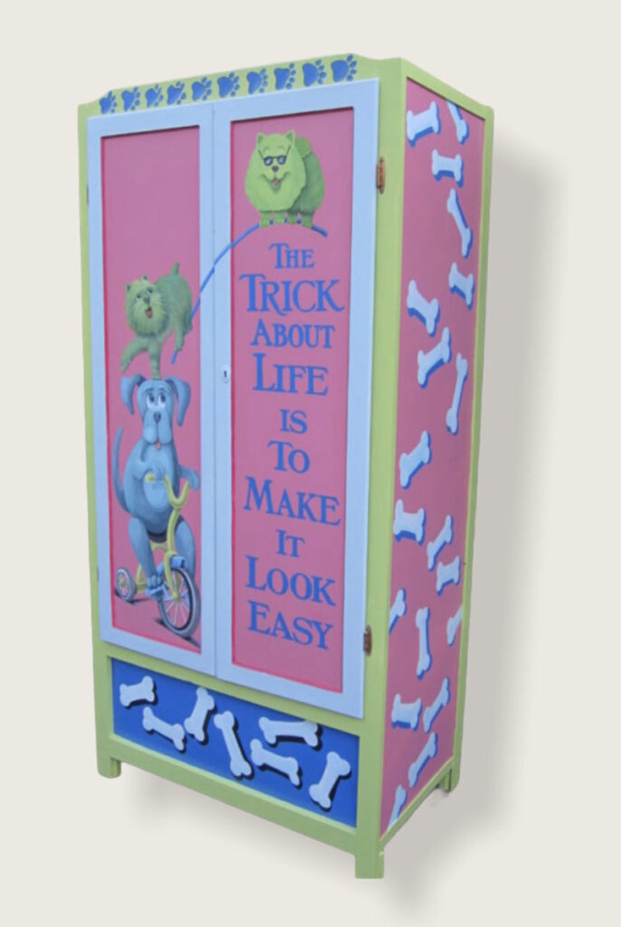
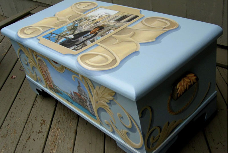
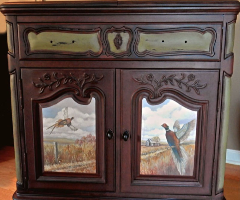
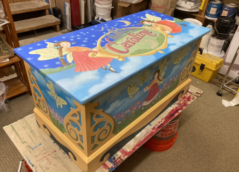
These are pieces I got to fully transform with paint,
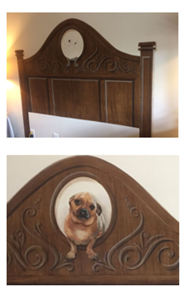
And lastly, the occasion when the furniture is no longer available. I had a client who needed a headboard to match her existing armoire. I painted a headboard directly on the wall, matching the woodgrain and scrollwork. Since I was “the builder”, I painted an oval opening with a portrait of the owner’s beloved pet. A perfect solution.
So there you are. I’m back to the studio to start samples for a boring console that’s looking for a new look. I might be just the solution for a piece of furniture that needs an update.


Sorry, the comment form is closed at this time.