I’m not asked often to redo kitchen cabinets. This recent project was a manageable size, and a great way to show you how effective paint can be in updating a kitchen.
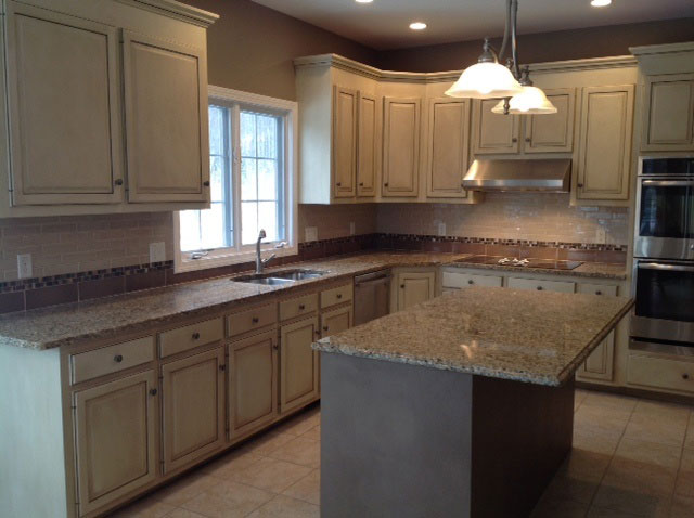
Keeping it short and sweet, here’s the finished kitchen.
Here’s what it looked like before.
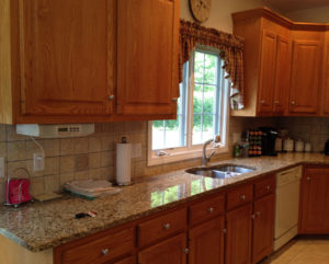
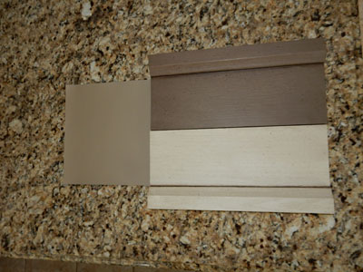
These oak cabinets are fairly standard. There was no reason to justify ripping them out, but boy, did they look dated and boring. The granite was going to stay, as well as the floor. My client liked the route that I think is more than just trendy of having a different finish for the island. It’s been around for a few years and I believe it’s going to become a standard. Here’s the sample boards I did, as well as a new color with a lot of punch in its depth for the walls.
My portion of the work was soooo easy. Super painter Dino Tetu and company (203-258-9818) dismantled the kitchen, removing all the panels, drawers and doors. These were primed, and then painted. Can’t say it enough: great prep insures a great finished job.
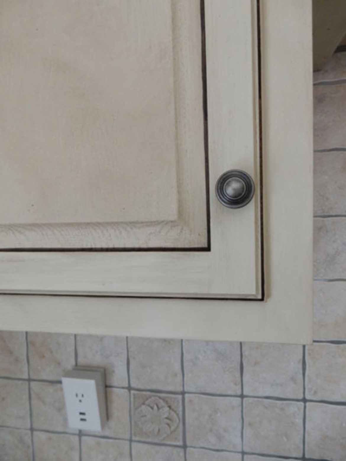
There is an artisan feel to the work as the glazing shows some of the irregularities of the wood by having variations in color. After I glazed them, I brought attention to the molding details by hand striping the edges on the panels and the crown molding. A little flyspecking was the final touch.

I gave all surfaces a double coat of clear matte finish for extra durability.
What gives the kitchen that perfect dynamic that tied everything together was a new backsplash. Kudos to Nancy Schneider of TileAmerica in Brookfield (203-740-8858) for a contemporary subway tile with personality. Take a look
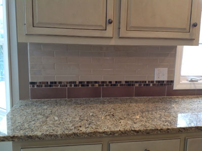
Paint and tile for a great transformation!
I have to admit, I do love when ONE simple little piece of cabinetry makes its way to me. Here’s the before
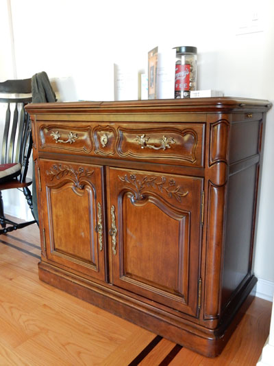
I redressed this little buffet to add some color to the living room. My palette was taken from the carpet. Here’s what it looks like now.
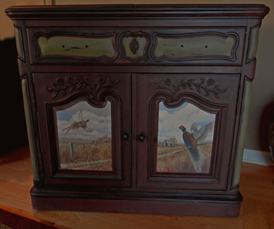
The main body is glazed with a rich merlot, revealing some areas of distressed black. The accent sections are an earthy green, glazed to match the body of the cabinet. The pheasants were chosen by the client. Here’s a close-up
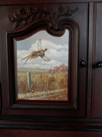
Some ornament of oak leaves and acorn are a rich addition to the completed look.
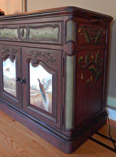
I simply love doing pieces like this. Taking a piece of furniture which has sentimental value and redressing it completely to reflect the colors and artwork the client chose.
I could do this seven days a week. It’s my idea of fun.
Got something you want to make your own, send me a picture. The possibilities are endless


Sorry, the comment form is closed at this time.