Some months when I have to choose what projects to talk about, it’s these little ones that get left undiscovered; small in scope but adding so much to the outcome of the room.
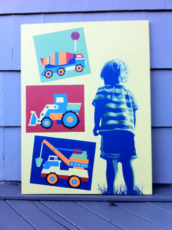
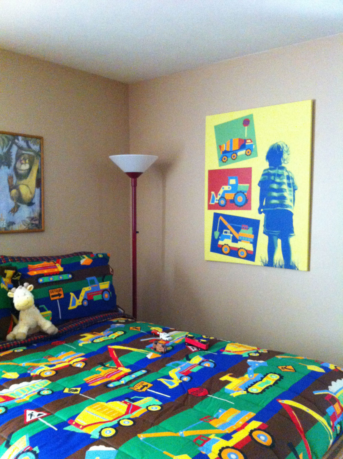
This first example started in my head as a simple silhouette of the child with some nice areas of color, taken from the fabrics in the room. However, it seemed as though it demanded a little dimension and the silhouette became a duotone, with the fun twist of the vibrant palette. Got to love that vibrant cobalt blue on a lemon yellow field! The young man is just about life size on this 30″x40″ canvas and to my pleasure, recognized himself immediately.
Here is the canvas hung on the wall in his new room.

This second example is much more subtle in its approach. Originally this master bedroom had been treated to a soft ochre/yellow sponge treatment by its owner. The tray ceiling which has so much area in the room had been simply painted ceiling white. My part in this project was first to establish a palette, which was derived from the bedding. The tray was then painted in several shades of the chosen blue; the lightest on the ceiling and then a few steps down with a little stronger hue on the slanted sides. Lastly, a definitive 4″ stripe gave a nice crisp edge to the walls.
The last part was to design an ornament to add a little more character. I thought you might be interested in seeing the process. Here were the choices:
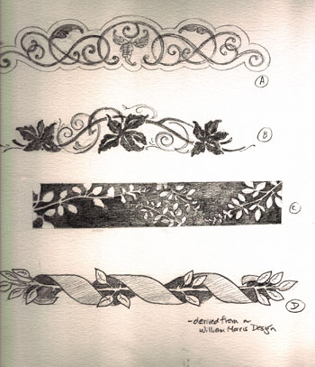
The owners chose B, a great choice as I derived it from the fabric itself. Given the scale of the room, I opted to paint it in one color so it wouldn’t get lost in the room. Here is the completed project.
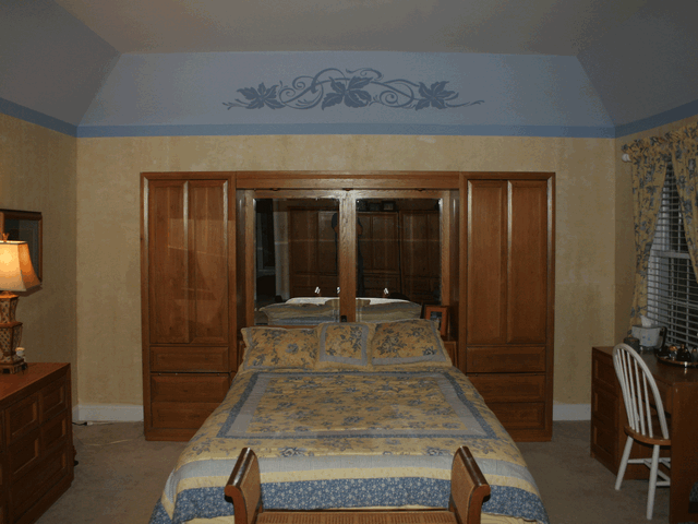
Small changes, BIG results!
Lastly, I did promise you a finished shot of the sign project I was involved with in last December’s newsletters. Here is a photo of the installed sign at Christmas Tree Lane.

It is nothing short of magnificent. I designed the sign, which was then made by Accent Signs of Stamford, CT. I heartily recommend them should you ever need their services. The sign was installed on a sunny, winter day and the gold-leaf carving was beautiful. For those of you who knew me in my first lifetime as “Sharon the Signpainter”, I can only tell you a thoroughly enjoyed myself in having a little taste of the past. The client of this project has a keen appreciation of the beauty and character of years gone by. We could not simply choose a typeface-even though there are thousands available-which captured the sensibilities of the hand-lettered alphabet. My part of this project, besides painting the illustration, was to hand-letter the letters and scrollwork, which was then used by Accent signs, carved and gilded.
Before signing off, I’d like to thank everyone who had a part in my receiving a “Best of Houzz 2013” award. I am honored to have been chosen as a recipient. For those not familiar with Houzz, check them out at www.Houzz.com. Hands down, it is the best source of interior design inspiration!
For your convenience, the Studio is now accepting MasterCard, Visa and American Express.
As always, I appreciate your interest and your feedback.


Sorry, the comment form is closed at this time.