As wonderful as it is to have a glorious, detailed mural on the work docket, there are many occasions where the solution is the more direct and simple. When done correctly, it is elegant. Being a decorative painter, there are just so many paint paths besides mural painting.
Two such occasions presented themselves recently. In the first, interior designer Dyane Pjura ( Shadee Lady Interior Design and Custom Window treatments in Shelton) wanted to discuss her vision for a new look for her client’s foyer. She showed me the carpet sample that would be used as the runner on the stairs.
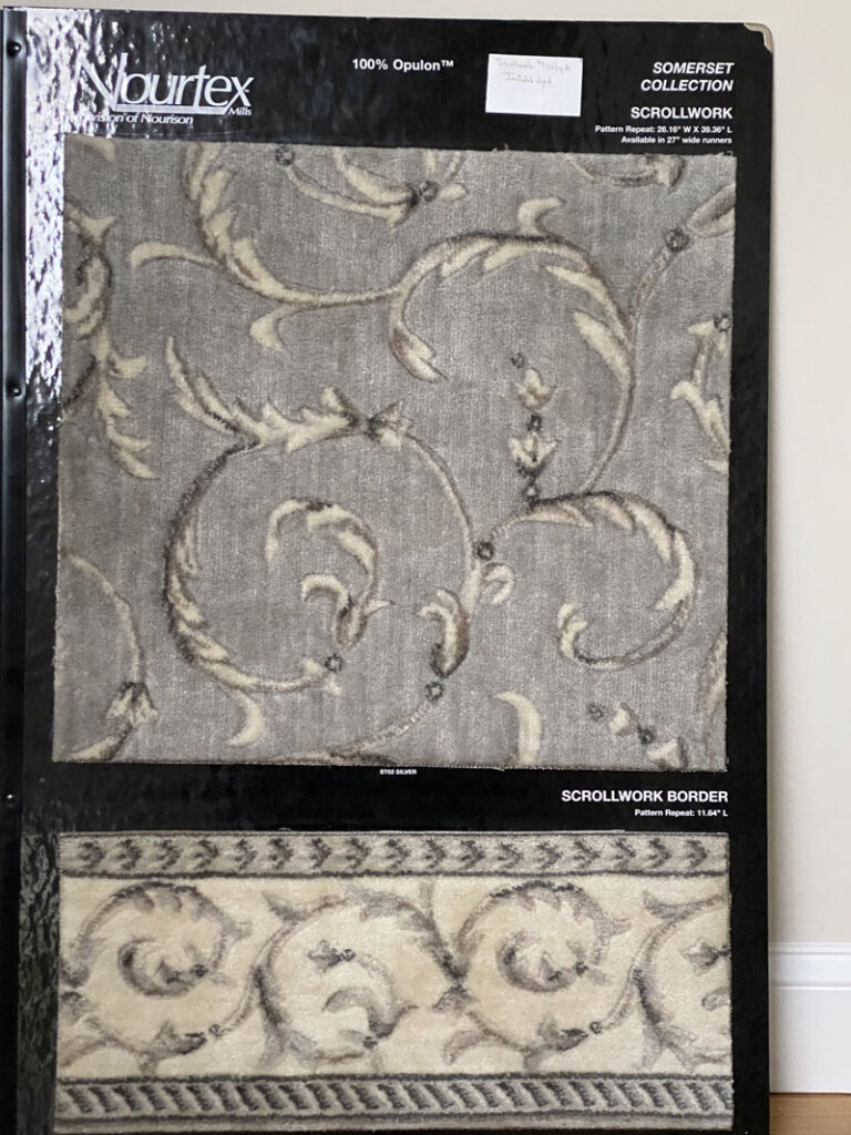
She said: “I see scrolls. Big scrolls”. “Ok”, I replied. “Just how big?”.
Pencil to paper shows the results.
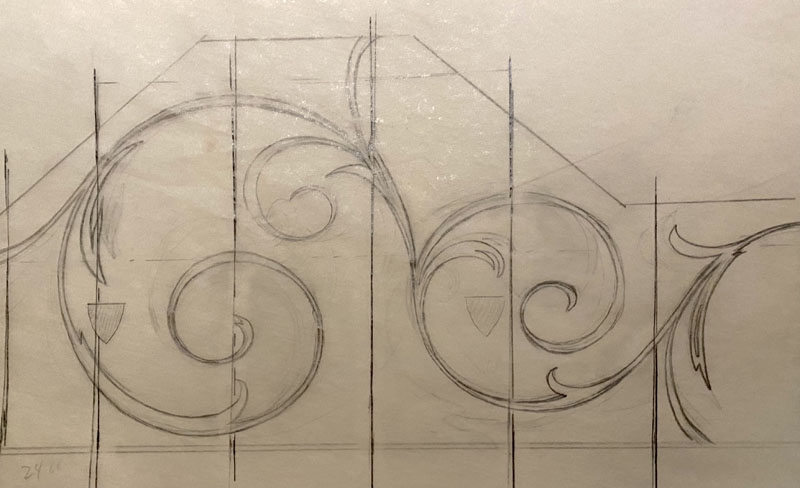
The largest scroll is almost 8 ½’ in diameter. The design was streamlined, one color only so the graphic had to carry the entire focus. No shadows to distract. Just scrolls.
Big, glorious scrolls. Take a look.
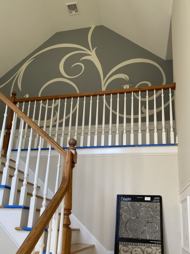
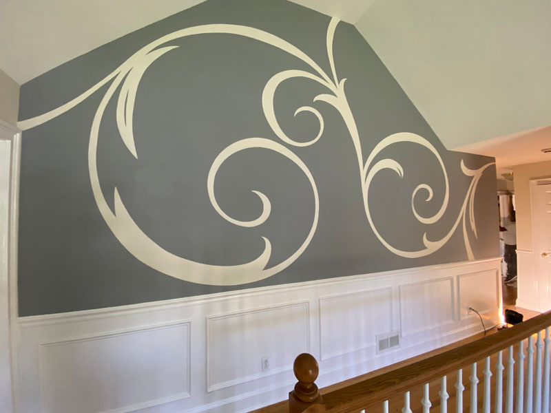
I could look at these for a long, long time.
The second occasion had a completely different set of requirements. Though there is no average or typical client, when your client is an interior designer, you are looking at a project through an additional pair of trained eyes. I’d known Barbara DeTullio for years, going back to when I was a sign painter. I lettered her delivery van for her showroom at the time, Metamorphosis. These days besides being a designer, her talents can be seen in her pottery work. Check her Facebook page, Nichols Pottery CT.
Barbara and her husband had moved to a new home. The first thing on the list of “that which has to go” was the traditional red brick fireplace and mantle.
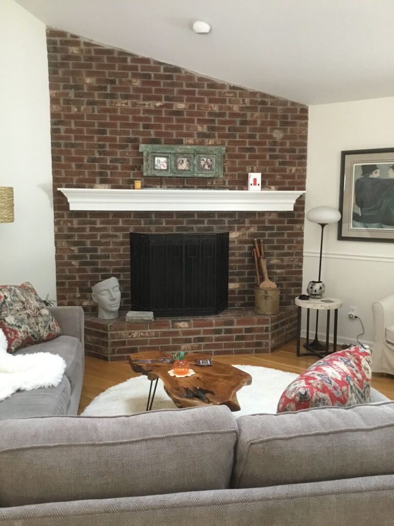
Barbara’s vision for the space was clean and simplified. The brick fireplace was overwhelming in size and presence. Soft whites and warm gray tones dictated her new palette. Indeed, the jarring red brick needed to disappear but she was looking for a solution more sophisticated than painting the brick a solid color, or whitewashing it to tone it down.
My solution was to finish the fireplace in exactly the colors I saw in the fabric, paint and furniture and do it in such a way that the brick looked as if it had been there forever and aged gracefully.
The entire surface, brick and grout, was base coated in a light color just the tiniest bit darker than the walls.
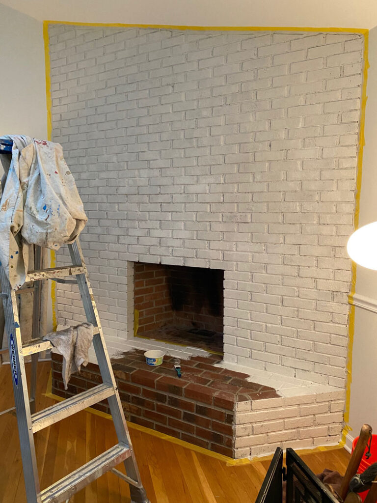
Knowing how ugly the next few layers would be, I warned that they would disappear soon, but I needed a percentage of the darker color. It got a bit scary looking.
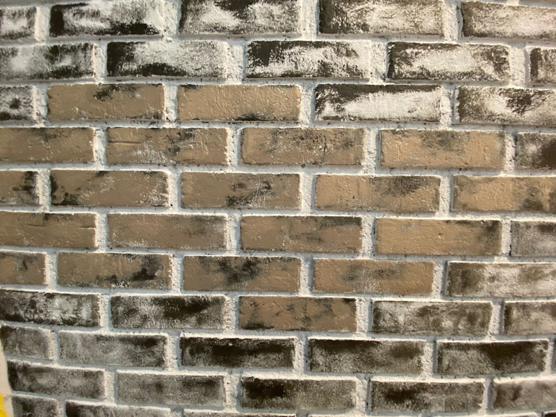
Layer by layer ( six in total) and lighter each time, I scrubbed the paint into the texture of the brick. Here’s a detail.
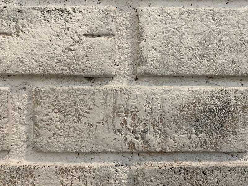
And without further ado, hand-painted weathered brick.
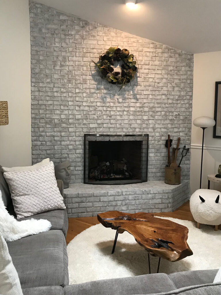
I love the new, sleek screen, a pewter frame with tempered glass. Like I said, less is more. And a special view…
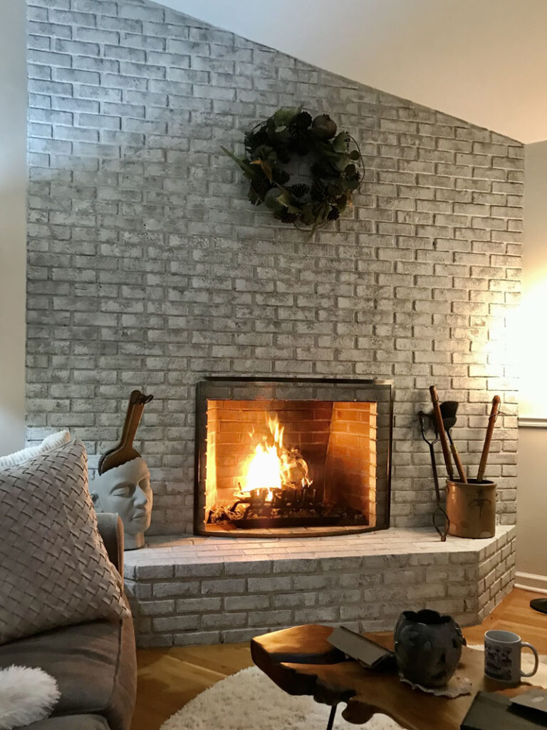
I love the results of both projects; the drama of the hand-painted scrolls, the ambience of the updated fireplace.
Need a solution for something in your home, let’s talk.
And in the spirit of the season, I am thankful to each and everyone of my clients and designers that has made my working in the field I love possible.
I’m more than grateful during this pandemic that my family remains healthy (my daughter Becky is fully recovered from her bout with covid early this spring.)
I sincerely wish you and yours good health as well. Stay safe.


Sorry, the comment form is closed at this time.