Thanksgiving is just around the corner and once I got this title in my head, I couldn’t let the metaphor go. Certainly it is the turkey that is the centerpiece of the traditional celebration, but it is those side dishes that add the flavors and creativity.
And so it is with my own portfolio. Yes, mural painting is the foundation of my work, but this month was a perfect example of those “side dishes” that don’t come around all that often, but when they do, what a treat!
The first project was a brick wall in a red palette that was just completely unacceptable for the marvelous kitchen renovation. My client thought a simple whitewashing would tone the color down. I have her permission to show you her thought to see how it might look. It was ingenious. She used chalk, and literally colored the bricks to check out the effect.
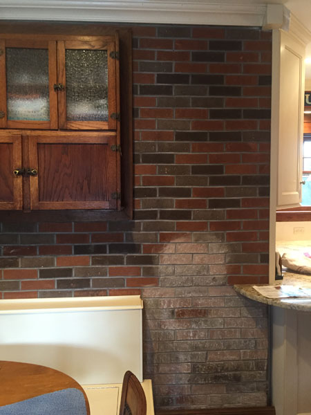
Not good. The result was dirty pink and coral tones.
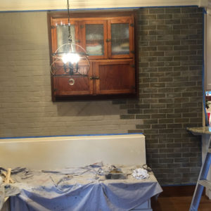
Below is the sample I created once the background had been painted.
And here’s how lovely it looked when completed.
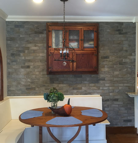
Very believable and custom matched to her granite, flooring and cabinetry.
I’ve also been doing quite a few canvas commissions.
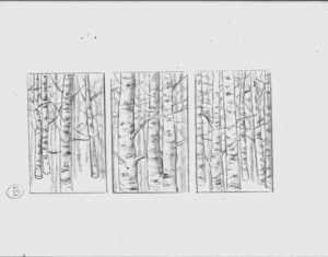
This family room needed large, bold artwork to complete the exquisite design of Bobbie Sue Smart of Smart Design in Newtown, CT. Each panel would measure 48″ 32″. Below is a preliminary sketch.
Now take a look at the finished room.
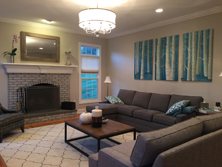
Check out the fireplace in this room as well. Originally, it was red brick. It took several washes of gray, scrubbed on brick by brick. I sealed the surface first so that the grout remained the original color. A true “whitewash” is applied over the entire surface and diminishes the crisp look of the grout.
The next project brought me back to my roots in sign painting. I know technology has brought vinyl lettering to look just like hand painting, but nothing, absolutely nothing, looks as good as the real hand crafted work. This can be seen at the fabulous Tazza osteria & bar in Fairfield, CT.
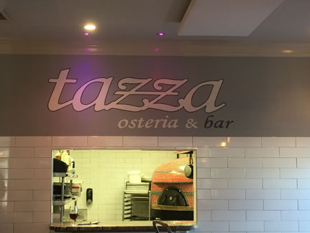
Check out their menu at www.tazzaosteriabar.com and look for their second location opening soon in Newtown.
Rounding out the tasting is a photo of the work I did for the smash HGTV hit, Property Brothers.
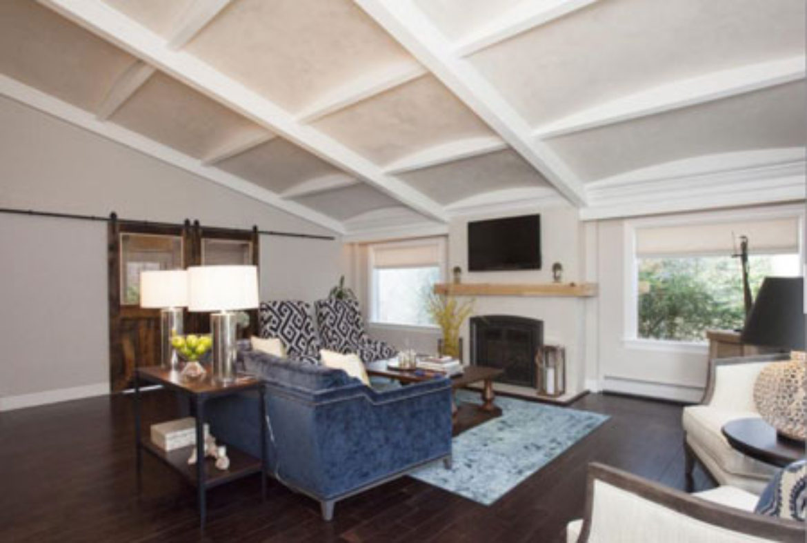
My TV debut lasted about 2 seconds, but the experience was terrific. The finish on the ceiling coffers is a mica-infused plaster. The curved surface added to the reflective effect.
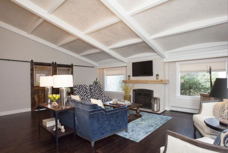
Among the things I am very thankful for is this opportunity that was provided to me by Bobbie Sue Smart, who was the lead designer of this episode and three others this season. I will have work showing in two more upcoming episodes and will keep you posted when I have the dates.
I am thankful to each and every one of you reading this newsletter. I appreciate your support.
Truly.


Sorry, the comment form is closed at this time.