Thank you so much to each and every one of you that send me your choice of your favorite powder room. I loved the feedback.
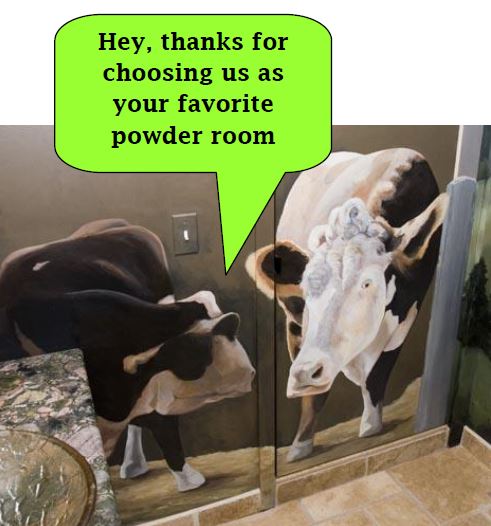
It was so much fun compiling that last newsletter, I thought, let’s do it again.
So here we go. Ceilings are often referred to as the “fifth wall”. And way too often, they are simply ignored. There are so many solutions that there is no excuse not to consider that ceiling the next time you are looking up at the expanse of flat ceiling white paint.
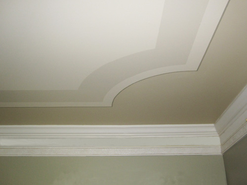
If you’ve got crown molding already (or are considering it), make it pop with anything but white. Here’s my answer to adding color and a few simple stripes for a simple solution.
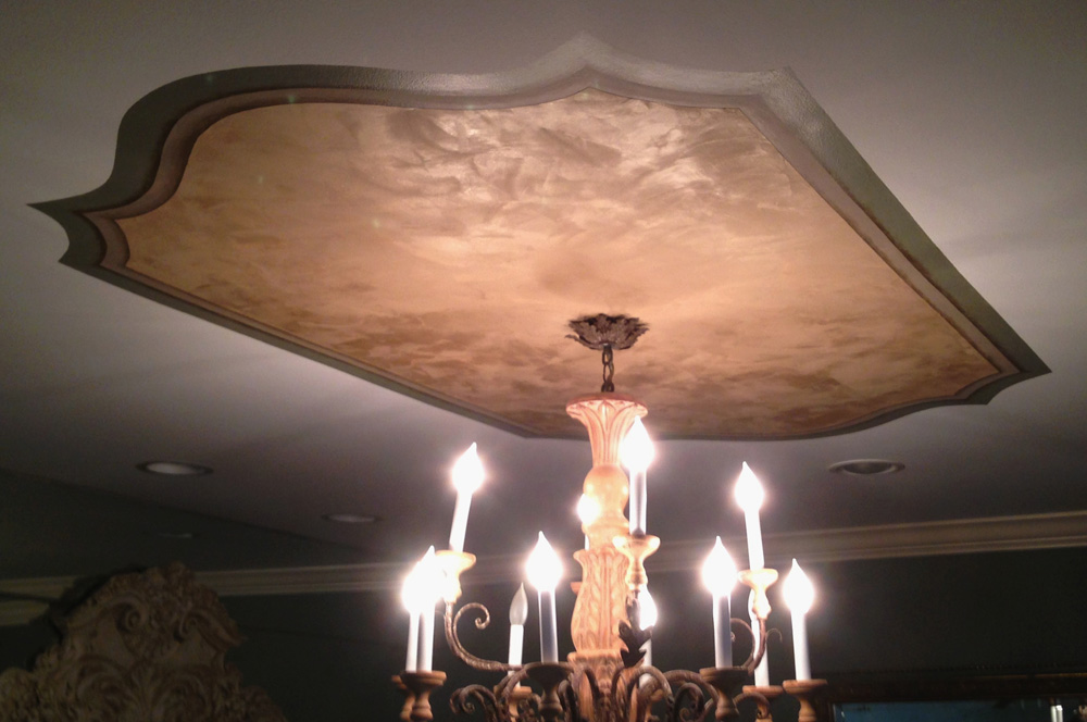
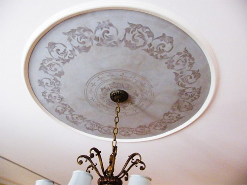
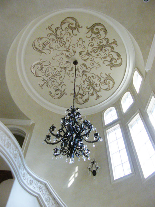
Below is an area of mica infused plaster that reflects the chandelier’s light. A border and shadow give dimension.
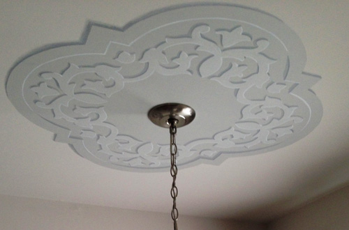
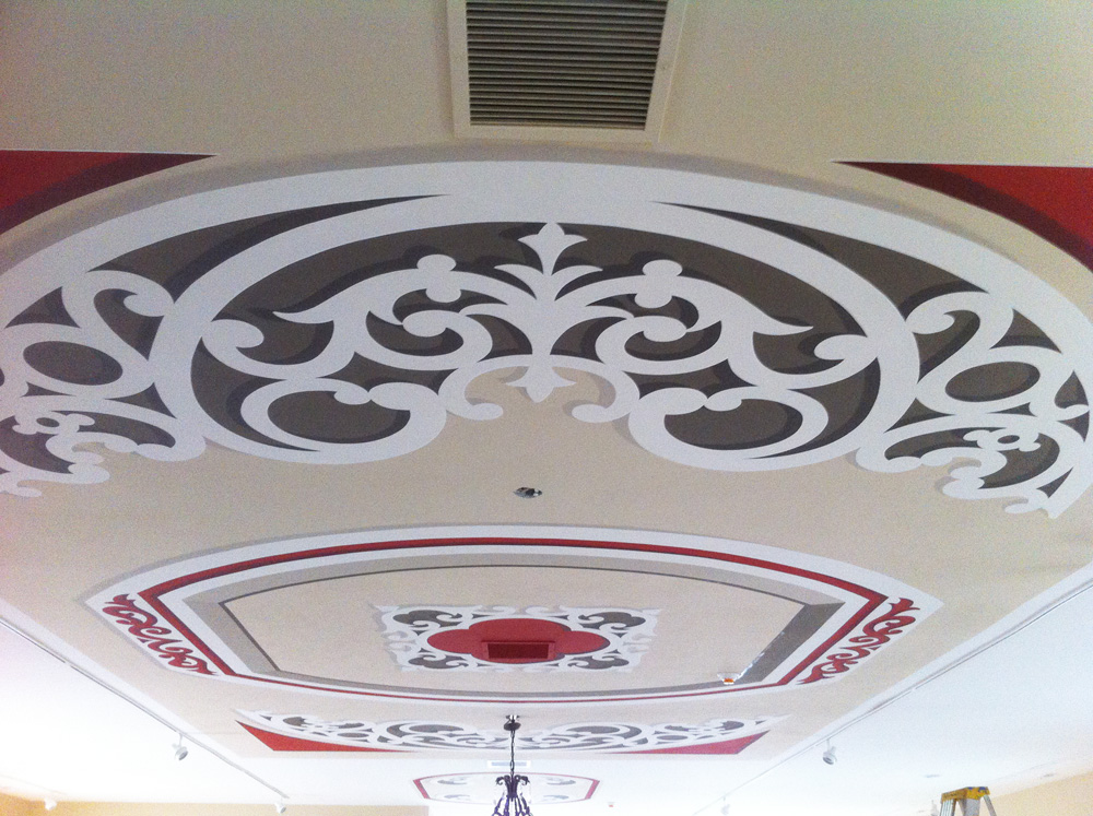
A ceiling treatment does not have to utilize the entire ceiling. Here are two trompe l’oeil medallions that add focus but are modest in dimension.
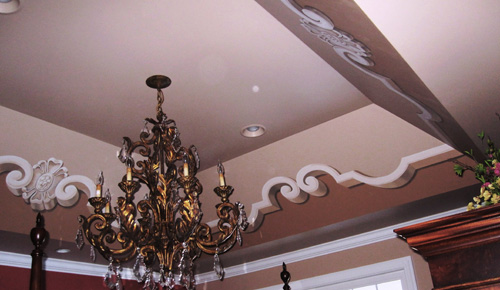
I see many master bedrooms that have very deep trays, with the sides being three to four feet. This design incorporated the entire space.
And then there are situations where I am so fortunate to have designers and homeowners that allow me to meet the challenge of really thinking outside the box.
This ceiling is to date, the largest curved or barrel ceiling I have painted.
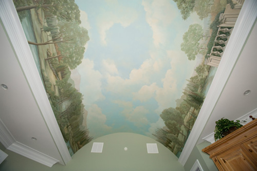
My neck muscles can attest that this next ceiling wasn’t too far behind in total area. The painted area was 18′ by 60′.
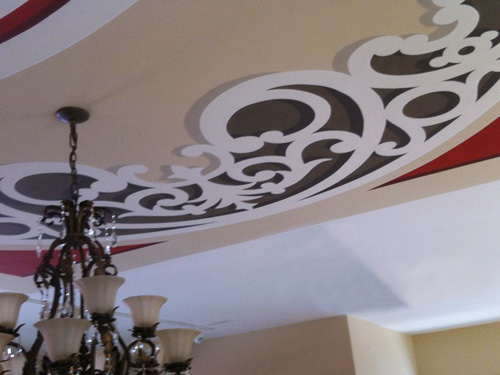
Below is a view of the entire space.
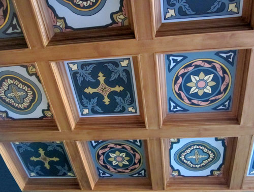
I had planned on cutting my own stencils for this next project but this true Victorian library nixed that approach. Each coffer had different measurements from the next, so I ended painting each by hand. The additional lining detail could only have been done by hand anyway to give that crisp edge I was looking for.
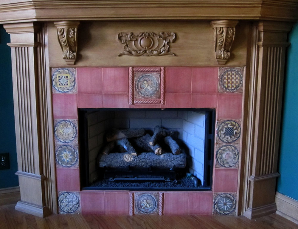
Here are the fileplace tiles that inspired the design.
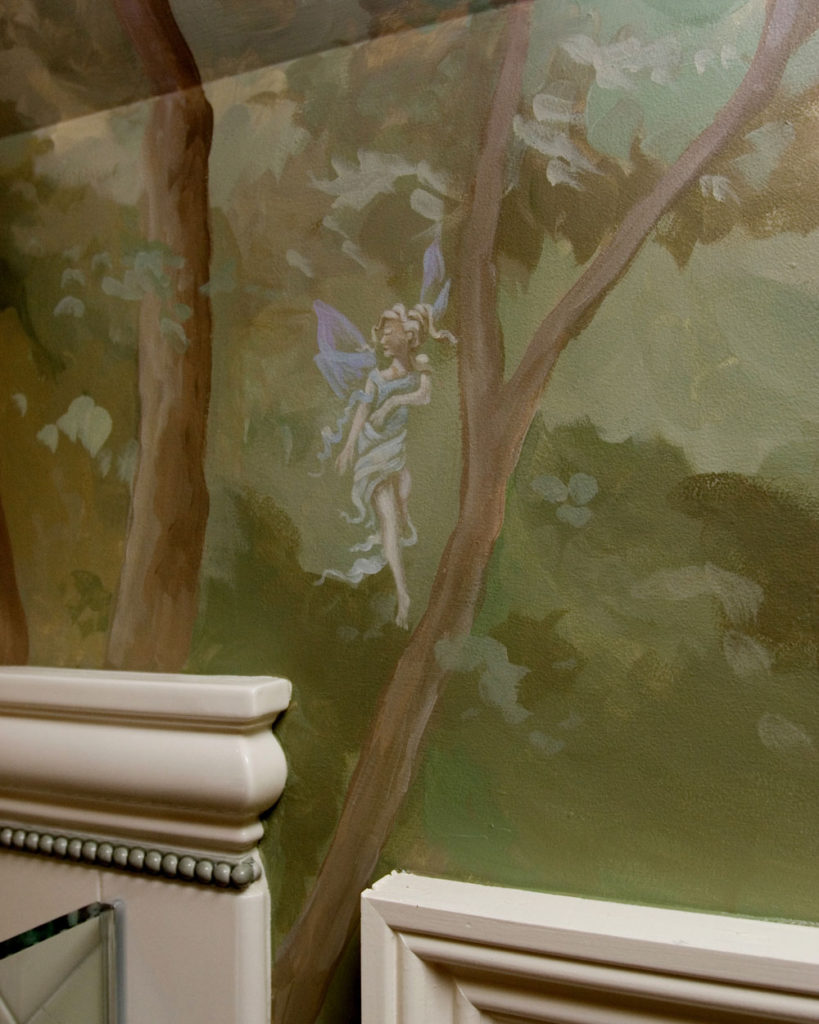
This bathroom was a mystical woodland design. The trees rose from the walls onto the ceiling forming a canopy. I have promised myself to someday paint something like this for myself in a space where I can read and sleep. I’d be very happy, trust me.
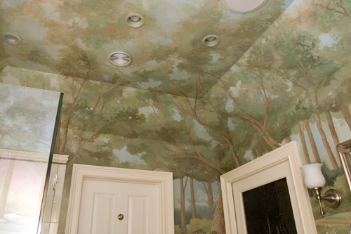
Below you can see the forest fairies scattered throughout the design.
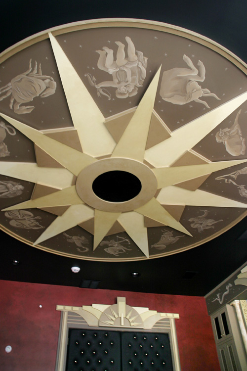
Classical astrology, anyone? This ceiling in a media room has a sepia collection of the twelve signs of the zodiac surrounding the art deco starburst that contains the electronics.
Here is the ceiling with the rest of the room.
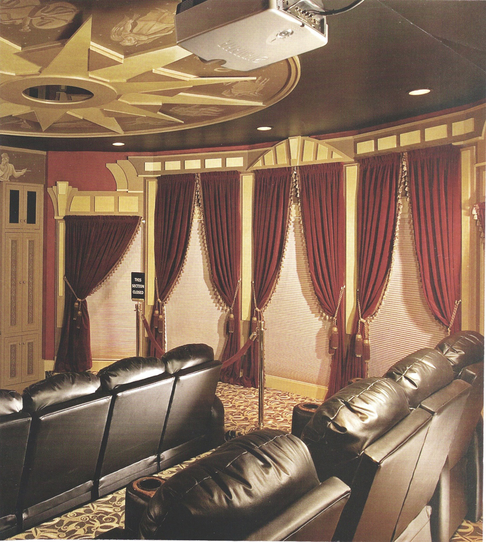
It is outstanding! The window treatments capture the era so well.
Rounding out my favorites…
A formal design for a dining room, complete with cherubs for each season.
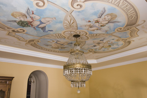
Ornament painted in metallic gold with shadows and highlights.
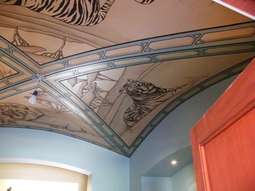
A graphic design reflects the owner’s passion for Safari.
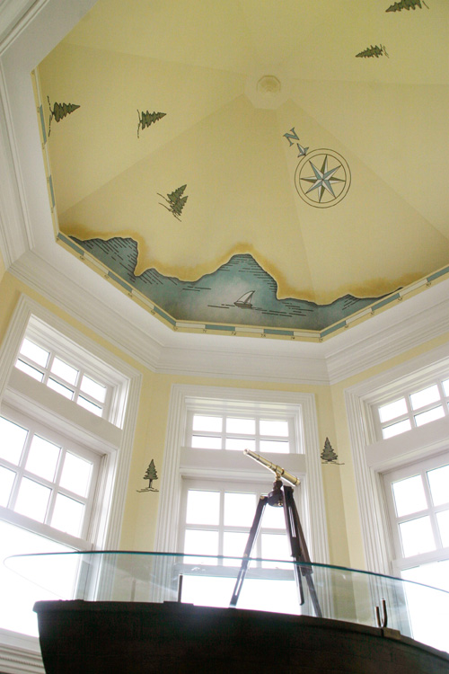
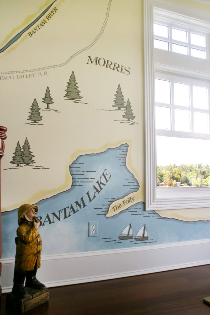
A less formal map approach captures the charm of this ceiling in a room looking out on the lake.
Here is the rest of the room.
So again, you know I’d love to hear which ceiling is your favorite.
And give me a call if you have a fifth wall calling for a little love!


Sorry, the comment form is closed at this time.